Nunchuk

15
We like the sleek and professional feel of the modern, minimalist geometric design in the Nunchuk logo.

Nunchuk Logo

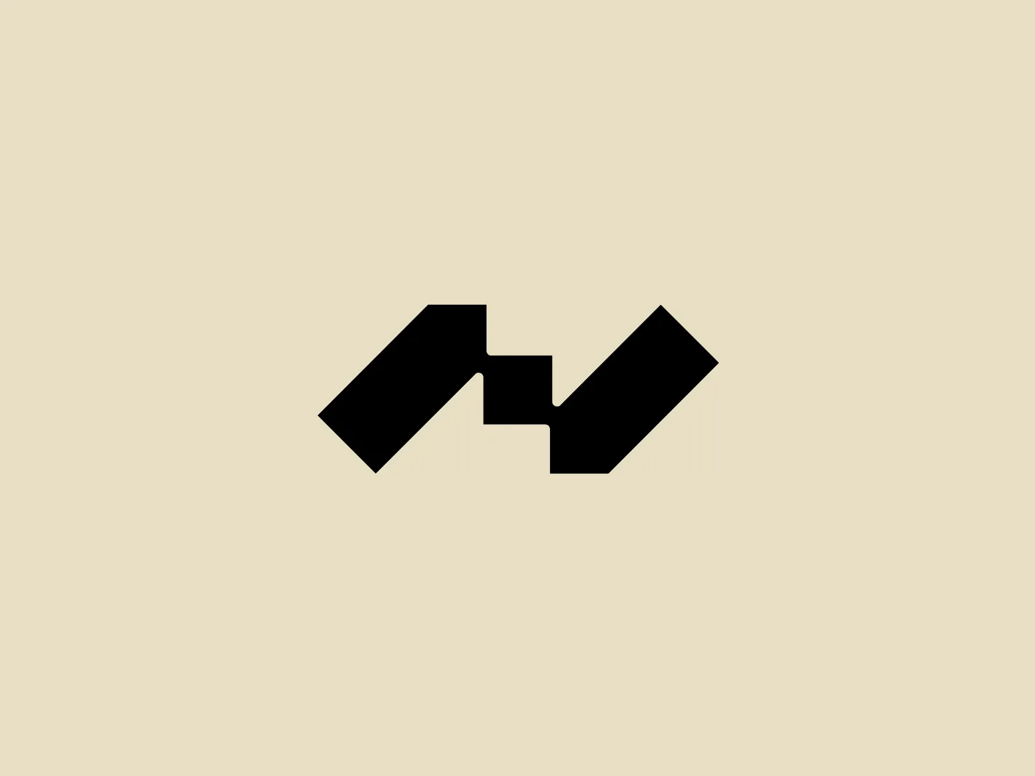
The logo for Nunchuk is a stylized abstract mark comprising black geometric shapes that create symmetry and balance. The mirrored arrangement features two parallelograms connected by a bridge-like negative space forming a v-shape in the middle. The modern, minimalist design aesthetic is conveyed through the angles and lines of the composition, creating a sleek and professional feel. The solid black color gives it a bold presence, making it versatile for various applications.

About Nunchuk

Nunchuk is a prominent provider of bitcoin wallets, committed to delivering high-level security and user-friendly solutions for the bitcoin community. The company is driven by a team of dedicated individuals with a strong vision for the future of finance and endeavors to bring about revolutionary changes in the industry.

Similar logos

The MIDI Association logo features a bold and stylized design with two arches that converge to form an abstract "M" shape. The symmetrical arches create a sense of balance and stability, resulting in a simplistic and modern design with clean lines and no additional embellishments. The black logo stands out well against lighter backgrounds and has a strong visual presence due to its thick lines and distinct negative space that forms the "M." The minimalistic aesthetic ensures broad versatility for various applications.
The Bardee logo is a stylized design consisting of two interlocked shapes that appear to be an abstract representation of the infinity symbol. Its contours are smooth and continuous, creating a sense of fluidity and connection. The design is black, simple, and bold against a white background, conveying elegance and modernity. The shapes are reminiscent of loops or ties, suggesting a theme of interconnectivity or eternity. The logo exudes sleekness and simplicity, making it versatile for various applications.
The Framer logo consists of a bold, abstract geometric design that features two black shapes on a white background. These shapes resemble stylized arrowheads or triangular segments arranged back-to-back with a right angle between them, creating a dynamic and forward-moving impression. The overall design aesthetic is minimalist, modern, and hints at movement or transition. The logo's sharp angles and contrasting colors give it a striking appearance.
The Gearbest logo features a bold, black, stylized smile at its center, with the ends of the smile tapering to points. This simplistic and cheerful smile is prominently positioned against a vibrant yellow square background with rounded corners. The overall design aesthetic is modern and minimalistic, suggesting friendliness and positivity. The design's high contrast and simplicity would stand out well against a variety of backgrounds but would be particularly striking on a light, muted color to maintain its vibrancy without overwhelming its simplicity.
The logo for École des Musiques Actuelles portrays a sleek, abstract design featuring a single continuous, wavy line. This line forms a rhythmic and dynamic visual effect with delicate curves at the beginning and end, extending into two sharp peaks resembling the letter "M," a stylized heartbeat, or sound waves. Rendered in bold black, the monochromatic logo stands out sharply against a light background, exuding a modern, minimalistic, and versatile aesthetic suggestive of movement and vitality, suitable for diverse branding applications.
The BETA Technologies logo features a bold, solid black letter "B" with a white lightning bolt cutting through its center, creating a modern and minimalist design. The stark contrast between the black and white elements emphasizes the strong visual impact of the logo. The lightning bolt infuses a sense of power and energy, suggesting dynamism and force. The classic, rounded attributes of the "B" combined with the edgy, contemporary feel of the lightning bolt create a striking visual identity for the business.
The Source B logo features a bold, uppercase letter "B" situated in the center of concentric, rounded rectangles. The design is monochromatic, using black for both the letter and the shapes, which gives it a strong and modern look. The rounded rectangles create a sense of depth and dimension as they appear to mimic the layers or slices of an onion, emanating outward from the central letter. The overall aesthetic is minimalist and would likely stand out on various media due to its simplicity and boldness.
The Akon Hidrolik logo exhibits a bold and minimalist design with a black square background. Within the square, a white geometric shape forms a stylized letter "a" with a red circle at the base, evoking the imagery of a needle's eye or a focal point. The overall aesthetic is modern and contemporary, utilizing primary colors and strong contrast to enhance its visual impact. Its simplicity renders it highly recognizable and versatile.
The logo in the image is the iconic symbol of Hashicorp. It features a stylized letter "H" constructed from six interlocking lines, creating a bold and modern hexagon-like shape with the illusion of three-dimensional depth. The design is monochromatic, featuring a stark black color against a plain white background. The letter "H" is centrally placed and utilizes negative space effectively to separate the vertical columns while connecting them through the horizontal middle part that seems to float. Its angular geometry conveys a sense of strength and structure, while its simplicity gives it a clean and contemporary feel.
The Xixili logo is a bold, abstract design featuring a symmetrical pattern formed by four comma-like shapes pointing inward towards the center, creating a stylized flower or pinwheel effect. The shapes are white and set against a square black background, providing a stark contrast. The sharp edges of the shapes and the square frame give it a modern and dynamic aesthetic. The simplicity of the two-tone color palette suggests a clean and professional brand identity.