Metrofor


Letter
Type
Color
Style
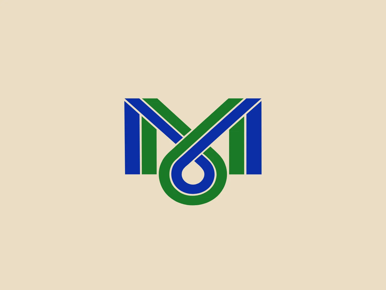
The Metrofor logo comprises two letters, with one resembling an 'M' and the other resembling an 'I', 'J', or a decorative element complementing the 'M'. The logo uses a rich, deep blue and a vibrant green, with the 'M' featuring bold, parallel lines descending into an elegant curve. This creates a continuous loop with a sense of motion and continuity. The logo has a modern, clean aesthetic with precise geometry, and the use of negative space and overlap adds visual depth. Sharp angles contrast with smooth curvature, suggesting a balance between stability and innovation.
Metrofor, also known as the Metropolitan of Fortaleza, is a metropolitan transportation system serving the Brazilian city of Fortaleza. It is operated by Companhia Cearense de Transportes Metropolitanos, a company with a focus on social capital.