Wonder

15
Something we like: The stylized "W" exudes a sense of connection and the bright blue color gives it a professional, modern feel.

Letter

Color

Blue
1490

Wonder Logo

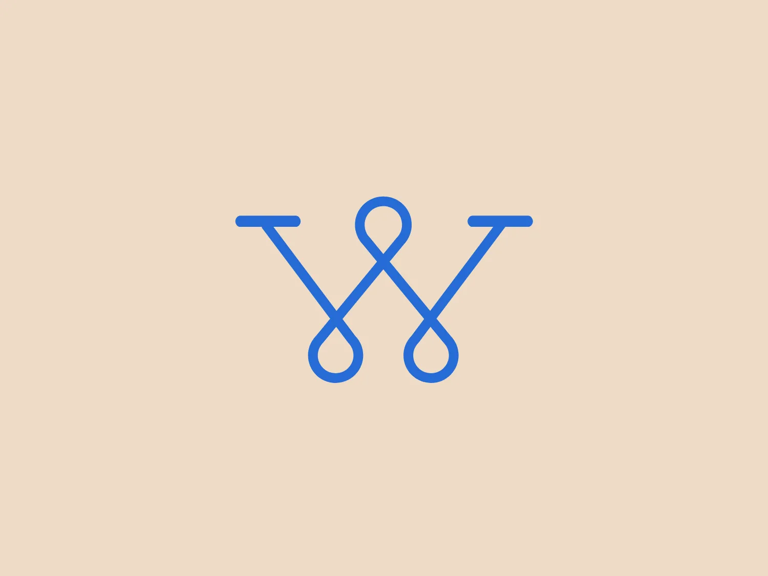
The logo in question features a stylized blue letter "W", with both the wedge-shaped ends and the rounded bottom suggesting a sense of connectedness or a loop. The color of the mark is a solid and bright shade of blue, which gives it a professional and tech-oriented feel. The lines are uniform in width, giving the logo a clean, balanced, and modern aesthetic. The symmetry of the design emphasizes stability and harmony. This logo would likely stand out nicely against a light and neutral background, which would complement its simplicity and modernity without overpowering the blue tones.

About Wonder

Wonder is an on-demand research service that provides thoroughly cited custom reports within a quick turnaround time, typically as little as 24 hours. The company utilizes a network of analysts to deliver comprehensive and reliable information for various projects and inquiries.

Similar logos

The Mobileye logo features a stylized letter 'n' with a distinct geometric design. It is comprised of bold, straight lines with sharp angles, creating a modern and minimalist aesthetic. The main component of the logo is a deep blue color, giving it a professional and trustworthy feel. The design is simple yet striking, with the use of negative space on the left side that could be interpreted as an abstract arrow or a partial square bracket, which adds an element of dynamism and forward-thinking to the overall design.
The image depicts the Akku Vertrieb logo with a bold, geometric design primarily using a bright blue color. The logo resembles an abstract depiction of an uppercase 'A' without the crossbar. It consists of three parallelogram shapes that form a stylized 'A' with white lines creating separation between them, adding a dynamic and layered effect. The design is sharp, modern, and conveys a sense of stability and professionalism. The simplicity and use of negative space give it a clean and versatile look, suitable for various applications.
The Unilever logo appears to consist of intricate and stylized illustrations forming a shield-like shape. The design features a collection of floral and organic patterns, ranging from leaves and flowers to abstract swirls, all densely packed to create a cohesive emblem. It is monochromatic, using a deep blue color which gives it a classic and professional appearance. The contrast between the negative space and the blue areas creates an engaging and dynamic visual effect, suggesting detail and craftsmanship. The logo has a symmetrical layout that adds to its balanced and harmonious look.
The Commodore logo features a large, bold, blue letter "C" that encircles a smaller red shape resembling a right-pointing arrow or a play button symbol. The stark contrast between the blue and red hues creates a striking and modern aesthetic. The absence of additional elements or embellishments underscores a commitment to clarity and efficiency in the design, striking a balance between visual impact and straightforward symbolism.
The Yatirim Finansman logo depicts a stylized, abstract design that looks like a combination of geometric shapes creating an optical illusion. The shape recalls a three-dimensional cube or box, with elements appearing to interlock. The logo uses two tones of a dark blue palette that give it depth and contrast. The design is modern, clean, and appears dynamic due to its contrasting planes that suggest movement or rotation. It would stand out crisply against a light background that doesn't compete with its color intensity.
The WildBrain logo features three stylized, abstract figures in various shades of blue, resembling a trio of birds or perhaps aquatic creatures, positioned side by side with their body shapes converging at the base. The figures have a minimalist look, with a smooth, rounded top edge that tapers down to a point. Each figure also contains a simple, circular black eye, adding a touch of character and life to the design. The shapes are devoid of intricate details, favoring a clean and modern aesthetic. Considering the cool blue tones, a soft, contrasting background color would complement the logo without overpowering it.
The Basis London logo presents a modern and minimalist stylized combination of geometric shapes that form the letter 'B'. The design consists of intersecting straight lines and curves in a dark blue or navy color, creating an illusion of three-dimensional layering. The negative space within the circular element adds to the overall balance and visual interest of the design.
The Telstra logo features a stylized uppercase letter "T" in bold, sans-serif font, and an abstract oval-like shape underneath. The vivid blue of the "T" exudes professionalism and trust, while the warm coral red of the shape adds a dynamic and energetic feel. The modern, simplistic aesthetic is characterized by clean lines and curves suggesting movement or stability. The red shape resembles a swoosh or pathway, implying progress or a journey.
The Ferrellgas logo is a minimalist, abstract design that features a single, fluid shape suggesting movement and dynamism. Resembling a stylized letter "F," the design has an elongated top arm sweeping forward and a shorter bottom arm curving underneath. Its bold, solid blue color exudes a strong, modern, and professional appearance, while the curvaceous lines convey a sense of flexibility and innovation. The simplicity and solid blue color make it adaptable for various applications without losing its visual impact.
The United Healthcare logo is a modern, abstract image composed of five vertical, parallel bands forming a stylized shield shape. The bands are uniformly spaced, cascading downwards and gradually decreasing in width from left to right. They taper to suggest depth and movement, with the leftmost band being the broadest, symbolizing the backbone of the shield. The deep, rich blue color conveys professionalism and stability. This minimalist design is associated with a corporation or entity that values strength, protection, and forward momentum. For a background that complements the logo without overwhelming it, a subtle and light hue would be ideal.