Washington Mutual


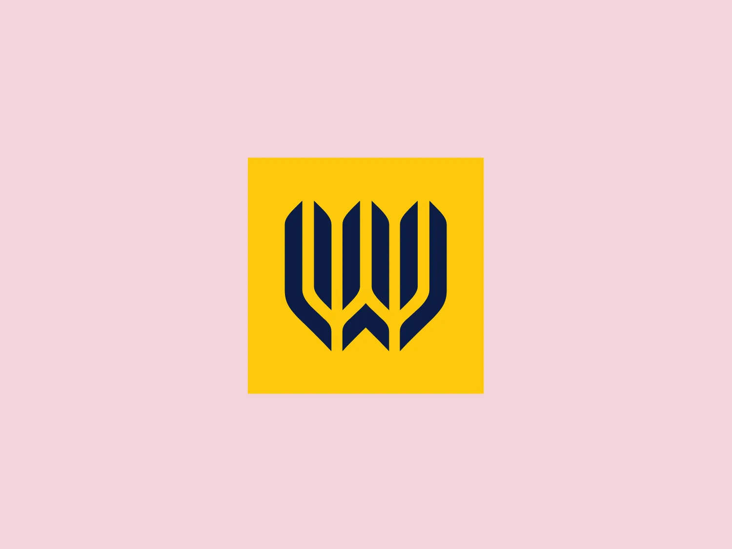
What catches our eye is the bold, symmetrical emblem with abstract shapes that exude strength and unity in the Washington Mutual logo.
Letter
Type
Color
Style
The Washington Mutual logo consists of a stylized emblem with three identical abstract shapes resembling leaves or petals, arranged symmetrically to form a unified motif resembling a crest or shield. The bold navy blue color of the shapes against a bright yellow square background creates a striking contrast, giving the logo a modern and dynamic feel. The aesthetic implies strength, growth, and unity.
Washington Mutual was a savings bank holding company that owned WaMu Bank, the largest savings and loan association in the United States until its collapse in 2008.
Similar logos
NEW

The Airbus Ventures logo features two overlapping geometric shapes forming an abstract mountain or a stylized letter "A." The deep navy blue color scheme exudes a professional and modern feel. The first shape is a right-angled triangle with its hypotenuse on the left and the smallest angle pointing downwards. The second shape follows the sloping right side of the triangle and curves inward to form a peak, creating an interlocking effect. This minimalistic design is bold and simple, making the logo versatile and easily recognizable.
NEW

The image depicts the Akku Vertrieb logo with a bold, geometric design primarily using a bright blue color. The logo resembles an abstract depiction of an uppercase 'A' without the crossbar. It consists of three parallelogram shapes that form a stylized 'A' with white lines creating separation between them, adding a dynamic and layered effect. The design is sharp, modern, and conveys a sense of stability and professionalism. The simplicity and use of negative space give it a clean and versatile look, suitable for various applications.
NEW

The Mobileye logo features a stylized letter 'n' with a distinct geometric design. It is comprised of bold, straight lines with sharp angles, creating a modern and minimalist aesthetic. The main component of the logo is a deep blue color, giving it a professional and trustworthy feel. The design is simple yet striking, with the use of negative space on the left side that could be interpreted as an abstract arrow or a partial square bracket, which adds an element of dynamism and forward-thinking to the overall design.
NEW

The Unilever logo appears to consist of intricate and stylized illustrations forming a shield-like shape. The design features a collection of floral and organic patterns, ranging from leaves and flowers to abstract swirls, all densely packed to create a cohesive emblem. It is monochromatic, using a deep blue color which gives it a classic and professional appearance. The contrast between the negative space and the blue areas creates an engaging and dynamic visual effect, suggesting detail and craftsmanship. The logo has a symmetrical layout that adds to its balanced and harmonious look.
NEW

The logo features a bold, uppercase letter 'T' centralized within an oval outline. The 'T' has a modern and sturdy design, presenting straight lines and squared edges that convey a sense of stability and strength. The color of both the 'T' and the oval border is a deep, navy blue, which adds to the professional and authoritative feel of the logo. The oval provides a sense of continuity and enclosure, framing the letter neatly and giving it prominence. There is an adequate amount of space between the 'T' and the oval border, highlighting the letter and making it the focal point. The simplicity of the design allows for versatility and clarity when displayed across various mediums.
NEW

The Commodore logo features a large, bold, blue letter "C" that encircles a smaller red shape resembling a right-pointing arrow or a play button symbol. The stark contrast between the blue and red hues creates a striking and modern aesthetic. The absence of additional elements or embellishments underscores a commitment to clarity and efficiency in the design, striking a balance between visual impact and straightforward symbolism.
NEW

The Breitling logo depicts a stylized, fluid letter "B" with elongated, curved strokes, giving it an elegant and dynamic appearance. The design is minimalist, using a bold golden yellow color that suggests luxury, quality, and sophistication. The overall aesthetic is modern and sleek, with a sense of movement and possibly creativity, hinted by the smooth lines that evoke a sense of continuity. Given the vibrancy of the golden hue, a subtle and light background would complement it well without competing for attention.
NEW

The Subway logo features two bold, interlocking arrows forming an 'S' shape, with the top arrow colored in a striking green and the bottom in a vibrant yellow. The design is clean and modern, with a dynamic sense of movement implied by the arrows pointing in opposite directions. This creates a sense of exchange, circulation, or progression, which might suggest a company involved in logistics, technology, or finance. The flat color treatment and lack of additional embellishments give it a contemporary and straightforward aesthetic.
NEW

The Shazam logo is a stylized representation of a dynamic and fluid shape reminiscent of a swirl or a spiral, contained within a circle. It consists of two interconnected, thick, curved lines creating a sense of motion and connectivity. The logo employs a duo-tone color scheme, with the main symbol in white standing out against a vibrant, deep blue background. The overall design aesthetic is modern, clean, and suggests either movement, digital technology, or a creative, abstract concept. Additionally, there is a gradient effect within the blue circle, giving it a more three-dimensional look and adding depth to the design.
NEW

The Norton Healthcare logo showcases a bold, uppercase 'N' in a deep, vivid blue color, comprised of four diagonal lines intersecting a vertical bar on the left. The design exudes a dynamic and modern aesthetic with sharp angles and clean lines, conveying speed, precision, and technological advancement. The intense blue color adds a professional and reliable feel to the overall appearance, while a neutral and light background would complement it well without detracting from its impact.