Egger Druck

15
What catches our eye is the minimalistic stylized crown with clean lines and muted color palette, radiating elegance and sophistication.

Egger Druck Logo

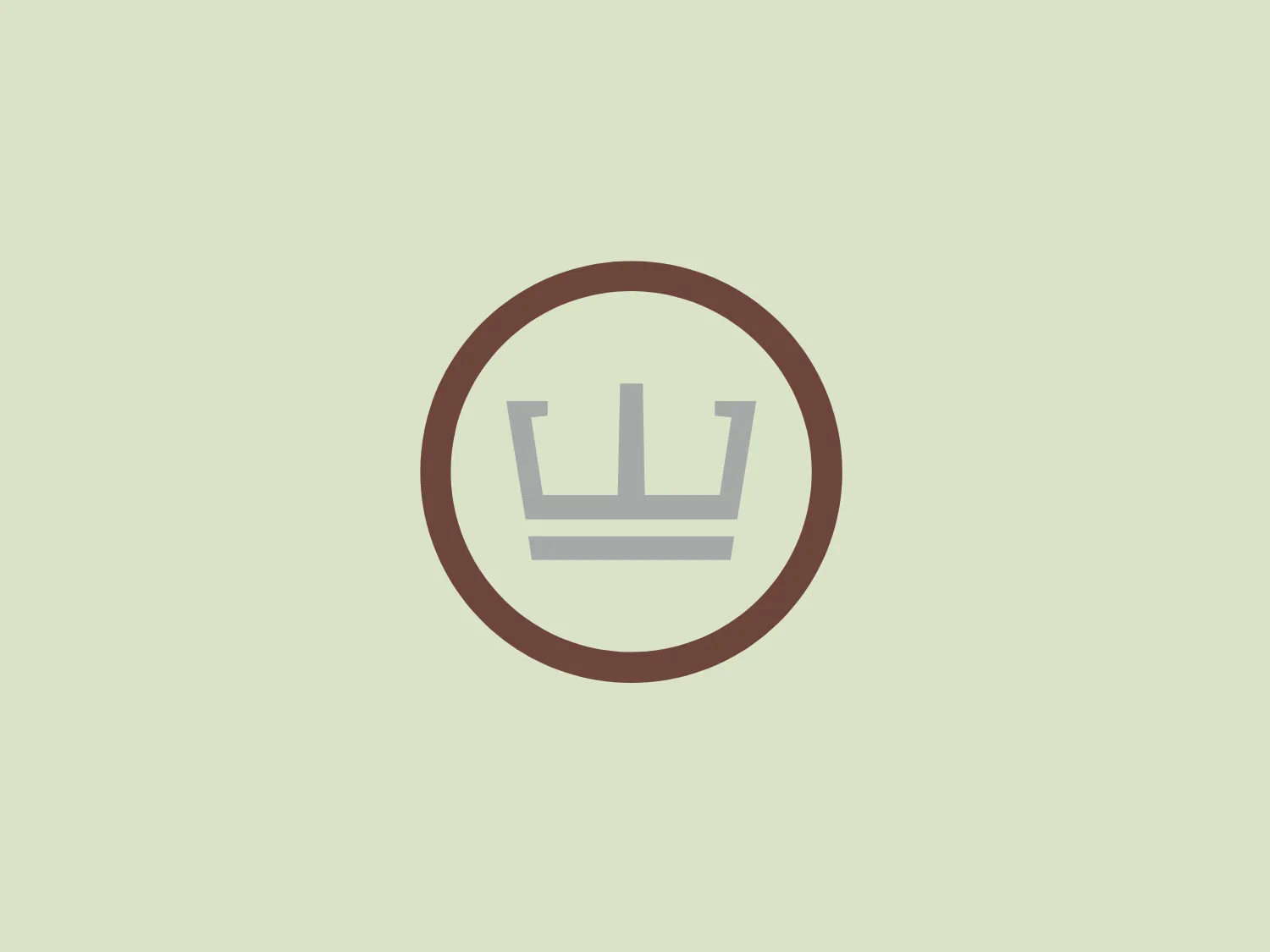
The Egger Druck logo features a stylized crown with clean, modern lines, consisting of three sharp points atop a simple horizontally-lined base resembling a band or ribbon. The entire icon is enveloped by a thick circular border. The color palette is muted, with shades of pale brown and grey, emphasizing a sophisticated and professional appeal. The design radiates a sense of minimalism and elegance. Considering the subtle colors of the logo, a background that allows the design to stand out without overwhelming it would be ideal.

About Egger Druck

EGGER Druck has built a solid reputation as a reliable provider of high-quality printing for over 145 years. The company specializes in the production of intricate folding boxes and traditional product packaging, with an unwavering dedication to excellence in every phase of the printing process.

Similar logos

The Standex logo features a stylized letter "E" created with three-dimensional rectangular blocks arranged at a slanted angle, effectively forming the shape of the letter. The solid dark gray color exudes a sleek and professional aura, while the minimalist and abstract design with clean lines and edges conveys stability and strength. The strategic use of negative space enhances its three-dimensional quality.
The Hyde Park logo features a stylized maze or labyrinth design, composed of straight, vertical and horizontal lines to construct a square, tiered pattern reminiscent of a geometrical puzzle. The aesthetic is minimalist and modern, employing a monochromatic color scheme that uses shades of dark grey to create contrast and depth. The design is symmetrical, exuding a sense of balance and precision. An interesting feature of this logo is its potential to be perceived as either a two-dimensional pattern or a three-dimensional structure, depending on how the viewer's eye navigates the interlocking lines.
The Urbane Coffee logo showcases a stylized cup or mug viewed from the top, with the letter 'U' seamlessly integrated into its design. The main shape resembles a 'U' or a horseshoe, drawn with smooth, symmetrical curves. The color palette includes dark brown, mint green, and a lighter shade of green, creating a modern and clean aesthetic. The bold dark outline contrasts with the soft green tones, accentuating the iconic shape and lending an organic, comforting feel. The logo strikes a balance between simplicity and a creative twist, embodying a contemporary look while remaining approachable.
The Orfeu logo is a stylized, abstract representation of a nature-inspired theme. It features two symmetrical halves arranged vertically, with three curved, horizontal stripes on each side suggesting movement or organic growth. The design is simple and modern, using a single warm brown color, denoting natural origins and earthiness. The smooth, rounded shape of the logo gives it a friendly and approachable look.
The image displays the Jacu logo, featuring a symmetrical, abstract shape resembling a blooming flower or a stylized letterform. It consists of two dark brown curved elements that mirror each other, tapering down to a rounded point at the bottom, with negative space creating a separation or central line. The design combines organic and modern aesthetics, with smooth curves and a minimalist approach, resulting in a sophisticated and elegant visual symbol. The simplicity and absence of additional embellishments provide a clean and versatile appearance suitable for varied branding applications.
The logo depicted for K Car is a stylized, geometric design composed of four squares positioned to form a larger square. The top two squares are contrasting in color; the left one is a solid red, and the right is a gradient from red to transparent, giving a pie-slice visual effect. The bottom two squares are shades of gray, with the left appearing slightly darker than the right. The logo has a modern and minimalistic look, with a balance of warm and cool tones. The clean lines and use of negative space create a sense of order and precision.
The XPRIZE Foundation logo features a bold 'X' symbol comprised of two overlapping bars with a three-dimensional effect. The primary colors are black and different shades of grey, creating a distinct contrast and visual depth. The bars appear to be shaped with right angles and have varying shades, suggesting light reflecting on a metallic surface. The logo is set against a solid, flat background, and its design exhibits a minimalist aesthetic while conveying a sense of sophistication and modernism.
The Pulsate logo features an abstract, organic shape resembling a speech bubble or thought bubble. It has a flat design with a two-tone color scheme, incorporating a deep, muted blue as the dominant color with a curved swoosh of a lighter, almost silver-grey tone at the bottom right that suggests a reflection or light source. The design is minimalist and modern, with a friendly and approachable feel, which could be suitable for a brand in the tech or communication sector. No text is included in the image provided.
The Assurex Global logo features an abstract, geometric design composed of triangular formations in two shades of yellow—bright and gold— outlined with a thin, light grey border. The sharp angles and contrast give it a modern, dynamic, and professional look.
The Polish Translators Association logo features an abstract design that seamlessly integrates the letter "T" with a book-like structure. The solid, dark brown color scheme exudes professionalism and scholarly sophistication. The top part of the "T" extends horizontally on both sides, creating an open book cover effect, while also clearly representing the letter "T". The logo's clean and modern lines, characterized by right angles and no extraneous elements, contribute to its robust and streamlined aesthetic.