Gidleigh Park

15
We like the circular, earthy design with an intricate white motif, adding visual interest and elegance to the Gidleigh Park logo.

Gidleigh Park Logo

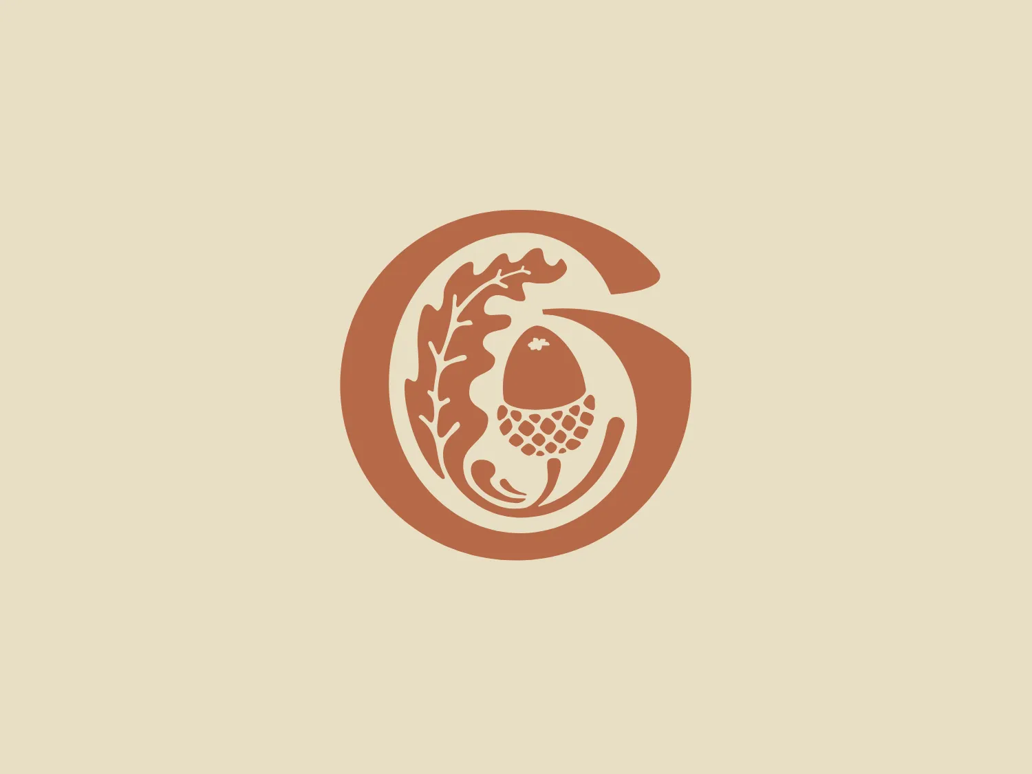
The Gidleigh Park logo consists of a circular element with organic features integrated into its design. The main color is a warm, copper-like shade, reminiscent of terracotta or rust, giving it an earthy, natural feel. Inside the circle, a white, abstract design resembling a floral motif or a segment of a specific natural element adorns it, providing a pleasing contrast. The circular form contributes to a sense of unity and continuity, while the intricate inner design adds visual interest and a touch of elegance. The overall aesthetic is minimalist, yet with a touch of sophistication due to the detailed artwork within the circle.

About Gidleigh Park

Gidleigh Park is a refined hotel that has been meticulously renovated, providing the pinnacle of opulent lodging set within 107 acres of Dartmoor National Park. The establishment also boasts an acclaimed restaurant recognized for its excellence in dining experiences.

Similar logos

The Framer logo consists of a bold, abstract geometric design that features two black shapes on a white background. These shapes resemble stylized arrowheads or triangular segments arranged back-to-back with a right angle between them, creating a dynamic and forward-moving impression. The overall design aesthetic is minimalist, modern, and hints at movement or transition. The logo's sharp angles and contrasting colors give it a striking appearance.
The Newsela logo features a square composed of a bold, bright blue outline with a slightly darker blue fill. Inside the square, there are two white rectangular shapes that resemble an open book or a window, given the symmetry and the central divide. The design is minimalist and modern, employing simple geometric shapes and a limited color palette to convey clarity and openness. With its clean lines and uncluttered appearance, the logo exudes professionalism and a sense of transparency.
The Browze logo features a continuous line that forms a sleek fusion of the letters 'V' and 'B'. The design exudes elegance and modernity with its fluid and organic structure. Presented in monochrome, the black against white creates a timeless and classic feel. Its minimalist aesthetic draws attention to the beauty of the line's curve and the use of negative space. The design's seamless flow may suggest connectivity or unity, and its simplicity allows for versatility and scalability.
The BETA Technologies logo features a bold, solid black letter "B" with a white lightning bolt cutting through its center, creating a modern and minimalist design. The stark contrast between the black and white elements emphasizes the strong visual impact of the logo. The lightning bolt infuses a sense of power and energy, suggesting dynamism and force. The classic, rounded attributes of the "B" combined with the edgy, contemporary feel of the lightning bolt create a striking visual identity for the business.
The Digikala logo features a bold, minimalist design with a strong geometric influence. It consists of a bright red square with rounded corners, suggesting a friendly, accessible brand personality. Within the square, there is a stylized white shape that resembles a smile or a welcoming gesture, reinforcing positive connotations and a customer-centric focus. The overall aesthetic is modern and simple, which allows for easy recognition and versatile application across various media. The use of negative space to create the inner shape is a clever design choice, adding depth and meaning to the iconography.
The Generale Bank logo is a minimalist design featuring a bold and modern 'G' created with sharp lines and curves. The solid, white letter sits centrally against a vibrant, flat, coral red square background. The 'G' has a geometric quality with its upper case form and is designed with a cutout that cleverly contributes to reading the letter correctly. The contrast between the bright white and the bold red makes the logo pop, indicative of a brand that aims to be seen as energetic and confident.
The Columbia SC logo features a vibrant, deep red rectangular background with rounded corners, creating a bold and attention-grabbing design. Centered on the background is a clean and modern white capital letter "H" with a contemporary aesthetic, featuring a slight gap between the vertical and horizontal strokes. The logo's balance of rounded edges and straight lines creates a dynamic and harmonious visual effect.
The Akon Hidrolik logo exhibits a bold and minimalist design with a black square background. Within the square, a white geometric shape forms a stylized letter "a" with a red circle at the base, evoking the imagery of a needle's eye or a focal point. The overall aesthetic is modern and contemporary, utilizing primary colors and strong contrast to enhance its visual impact. Its simplicity renders it highly recognizable and versatile.
The Xixili logo is a bold, abstract design featuring a symmetrical pattern formed by four comma-like shapes pointing inward towards the center, creating a stylized flower or pinwheel effect. The shapes are white and set against a square black background, providing a stark contrast. The sharp edges of the shapes and the square frame give it a modern and dynamic aesthetic. The simplicity of the two-tone color palette suggests a clean and professional brand identity.
The PadRabbit logo features a stylized, abstract design of a rabbit cleverly incorporated into the negative space of a bold, black letter "R." The black and white color scheme is striking and minimalist, highlighting the clever use of space within the letter to suggest the form of the rabbit, complete with a suggestion of an eye, ears, and head. The overall design aesthetic is modern, clean, and would be highly recognizable even from a distance. The design effectively captures attention through its simplicity and the surprise element of the hidden animal figure.