Vye
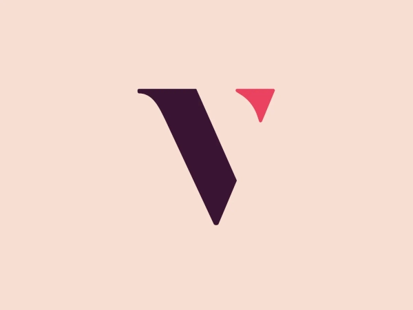


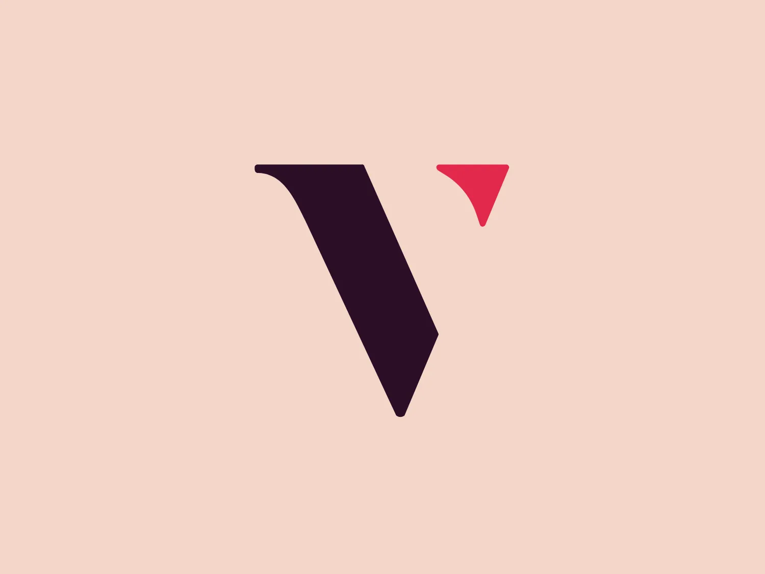
Something we like: The Vye logo's sleek, minimalist design and balanced asymmetry convey sophistication and versatility.
Letter
Type
Color
Style
The Vye logo features two geometric shapes with a sleek, minimalist design. A dark purple, right-angled, elongated parallelogram tilted to the right exudes forward motion, complemented by a contrasting pop of color from a smaller, inverted, coral pink triangle positioned to the upper right. This clean, sharp-edged design with balanced asymmetry conveys sophistication and versatility across various mediums.
Vye offers a modern approach to marketing by integrating technology, data, and creativity. The company's goal is to reshape marketing as a quantifiable and impactful investment for business growth.
Similar logos
NEW

The Lazada logo features a stylized three-dimensional shape reminiscent of a cube with a portion of its structure removed or invisible, creating an open corner perspective. It consists of two visible faces, with the left face in a vibrant orange and the right face in a hot pink, employing a gradient that combines the two colors seamlessly at the edge where they meet. The use of color and shading gives the logo a luminous, dynamic look, evoking a sense of innovation and modernity. There are subtle highlights and shadows on the faces that suggest depth and dimensionality. The overall design aesthetic is minimalist, bold, and contemporary, with a playful twist on geometric representation.
NEW

The Kuda Bank logo features a stylized letter 'K' mirrored and joined in the middle to form a symmetrical design that resembles a chevron or arrow pointing to the left. The 'K' shapes are composed of four solid stripes with sharp angles, creating a dynamic and modern look. The color of the logo is a deep, rich purple, giving it a sense of sophistication and regality. There are no additional embellishments, allowing the clean and bold geometry of the letterforms to stand out.
NEW

The Angi logo showcases a sleek "A" in a vibrant coral red color. Its modern and minimalistic design includes a flowing curve that creates an engaging loop at the base, imparting a friendly and professional look. The bold typeface with smooth edges balances thick and thin strokes, exuding both weight and elegance. The logo's style and color suggest a preference for a complementary background that doesn't overshadow it.
NEW

The logo presents a stylized circular shape with a smaller circle connected to its upper right, resembling an abstract representation of a person or a molecule. The main circle has an even, hollow center, contributing to the minimalist design. The design is composed of a solid, deep purple color, giving it a professional and modern appearance. The logo for Fresco's simplicity makes it versatile and easily recognizable. The absence of additional elements ensures the focus remains on this unique, clean geometric form.
NEW

The Marberg logo features a stylized, geometric design made of three parallelograms arranged to create a sense of perspective and three-dimensionality. The shapes are aligned to give an impression of depth, with the largest at the front and the smallest at the back. It uses a solid, dark purplish color for the shapes, which adds to its modern and sophisticated aesthetic. The simplicity of the Marberg logo makes it versatile and easily recognizable.
NEW

The Telstra logo features a stylized uppercase letter "T" in bold, sans-serif font, and an abstract oval-like shape underneath. The vivid blue of the "T" exudes professionalism and trust, while the warm coral red of the shape adds a dynamic and energetic feel. The modern, simplistic aesthetic is characterized by clean lines and curves suggesting movement or stability. The red shape resembles a swoosh or pathway, implying progress or a journey.
NEW

The Kelloggs logo is a stylized letter "K," rendered in a vibrant, solid pink/magenta color. Its design is fluid and modern, with smooth, flowing lines and tapered ends that suggest speed and dynamism. The "K" seems calligraphic, with characteristics reminiscent of a brush stroke or a signature. The design aesthetic is sleek and minimalist, appealing to contemporary sensibilities while maintaining a sense of individuality and flair. Given its color and design, a contrasting yet subtle background color would complement it well.
NEW

The Resonator logo is a stylized letter 'R' crafted with bold, geometric shapes and a modern, minimalist aesthetic. It features a vibrant purple color, evoking creativity and uniqueness. The 'R' is constructed with seamless straight and curved lines, creating a sense of continuity and flow. The top part extends outward with a slight curve, while the leg is formed by a downward stroke that curls inward at the bottom, giving the logo a distinct and memorable look.
NEW

The logo presented for Proximus is a stylized, symmetric icon that resembles a combination of the letter "X" and an infinity symbol. It consists of smooth curves and loops, with the ends of the "X" shape thickening into rounded terminations, creating a sense of continuous movement or looping. The logo's color is a shade of deep purple, which adds a feel of sophistication and modernity. An interesting feature is the illusion of interweaving paths that could symbolize connection or interaction. The overall design aesthetic is minimalistic, clean, and would suit a contemporary brand or technology company.
NEW

The John Muir Health logo appears to be a stylized letter constructed from geometric shapes, featuring a combination of a darker and lighter shade of purple. The design is symmetric along a vertical axis, with the left side mirrored on the right. The logo consists of four distinct sections, each resembling an abstract petal or leaf shape rounded at the top and converging to a sharp point at the center bottom. The overall aesthetic is modern and minimalistic with a clean, crisp feel exuding professionalism and sophistication.