Eurowings

15
We like the modern, three-dimensional chevron layers in the Eurowings logo, creating a sense of depth and forward momentum with a sleek, glossy finish.

Letter

Color

Eurowings Logo

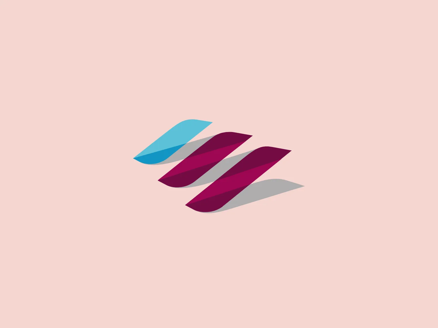
The Eurowings logo features three-dimensional stylized chevrons layered over one another, creating a sense of depth and motion. The foremost shape is a light cyan blue (#4BC6E7), followed by a deeper magenta (#9C1A6F), both exhibiting a glossy sheen. The use of shadow adds to the perception of the shapes floating above the surface. The design aesthetic is modern and dynamic, suitable for a brand that conveys innovation and forward momentum. The simplicity of the design allows for scalability and versatility in various applications. Hexcode: #E9E5CF

About Eurowings

Eurowings is a subsidiary of Lufthansa, operating as a low-cost carrier based in Germany. The airline provides flights to numerous destinations across Europe and has also extended its services to include long-haul flights, a first for a low-cost carrier in the industry.

Similar logos

The Astro Framework logo showcases a bold and abstract design with a modern appeal. It is composed of two primary elements: an upper black shape resembling an inverted 'V' or a stylized 'A' without a crossbar, and a lower magenta element that curves upwards, hinting at motion or a smile. The striking contrast between stark black and vibrant magenta adds visual impact while the smooth curves soften the angularity. The logo's simplicity gives it a versatile and easily recognizable appearance.
The Xinja logo is showcased in a bold, magenta-toned pink color with a modern and dynamic design. It consists of an abstract mark formed by a combination of geometric shapes: an elongated, rounded rectangle, diagonally bisected, paired with two droplet-like shapes that create a sense of motion or transformation. The overall aesthetic is minimalist and contemporary, with a sense of fluidity and innovation. The design is simplistic, relying on the impactful use of color and form rather than intricate detail, making it versatile and easily recognizable.
The logo presented here is a minimalist and modern design composed of three parallelogram shapes, each with a varying shade of bright purple and magenta. The parallelograms are arranged in a dynamic, leaning position, giving the impression of forward motion or progression. The largest parallelogram is on the right and is the darkest in color; the middle one is of medium size and a mid-tone purple; and the smallest is the brightest, on the left. The sharp angles and bold saturation of the design convey an energetic and contemporary feel. The clean lines and absence of additional embellishments highlight the logo's sleek and straightforward aesthetic. Given the vibrancy of these colors, a background that complements without overwhelming would be ideal.
The Brandcast logo features a stylized letter "B" composed of four distinct, quarter-circle sections that create a segmented modern look. The colors transition beautifully from a bold purple at the top left, to a deep blue at the top right, then to a bright cyan transitioning to a vibrant pink at the bottom. The design is clean and minimalist with a soft, rounded typeface. The color palette evokes creativity and innovation with a gradient that gives the illusion of a three-dimensional object. The merging of colors suggests connectivity and integration.
The Boonli logo features a stylized, continuous loop resembling an abstract figure-eight or infinity symbol. It consists of two intertwined segments with a gradient color transition, starting from a rich magenta on one end, blending into a deep violet, and finishing with a vibrant orange on the other extremity. The colors give it a dynamic and modern feel, while the smooth curves suggest fluidity and connection. This design is sleek and minimalistic, with no additional embellishments, making it versatile and easily recognizable.
The Creative Folkestone logo features a series of six square shapes arranged in a 2x3 grid. Each square showcases a bold and vibrant color palette, including blue, green, pink, yellow, dark gray, and cyan. The modern and simplistic design adopts a flat color aesthetic with no gradients or shadows, giving it a contemporary and digital feel. The tightly packed squares convey a sense of cohesion and unity within the logo.
The Hamilton Philharmonic Orchestra logo displayed is a modern, abstract design consisting of concentric shapes that form a stylized letter "O". The shapes are reminiscent of topographic lines on a map or the grooves of a vinyl record, suggesting depth and movement. The color gradient transitions smoothly from magenta at the bottom to a deep violet at the top, creating a sense of vibrancy and energy. The lines vary in thickness, and their undulating pattern gives the logo a dynamic and rhythmic quality. The white space in the center emphasizes the geometric precision of the design. Given the vibrant hues of the Hamilton Philharmonic Orchestra logo, a more understated background would complement it well.
The Marcha FM logo features a modern, abstract design with a flowing, ribbon-like shape. It combines two tones of color: a vibrant, deep magenta transitioning into a darker, purple shade, contributing to its dynamic and smooth appearance. The curves of the logo suggest motion and fluidity, while the tapering ends of the shape add a sense of finesse and precision. The minimalist style and the absence of any text or additional elements focus all attention on the wavelike form, making it versatile for various applications. Given its colorful nature, a neutral background would complement it well.
The Xspray logo features a minimalist and modern design, portraying a stylized, abstract figure combining a circular head with a cross-like body. The bright blue color with a softer cyan tone adds to its clean and friendly appearance. The logo exudes a sense of action and movement, emphasizing a minimalistic design approach without any additional embellishments or text.
The E-ridez logo showcases a circular shape with a stylized letter "Z" at the center. It consists of overlapping triangular and polygonal elements, with a gradient effect transitioning from deep violet to vibrant cyan. The design exudes a modern and dynamic aesthetic, representing movement and cutting-edge technology. The graphic elements, including sharp angles and whitespace within the "Z," contribute to the overall sense of energy and innovation in the design.