ZipSeam

15
What catches our eye is the modern, digital "Z" logo with a vibrant cyan-to-turquoise gradient, and the clever incorporation of circuit board connectors, reflecting a high-tech aesthetic with sleek simplicity.

ZipSeam Logo

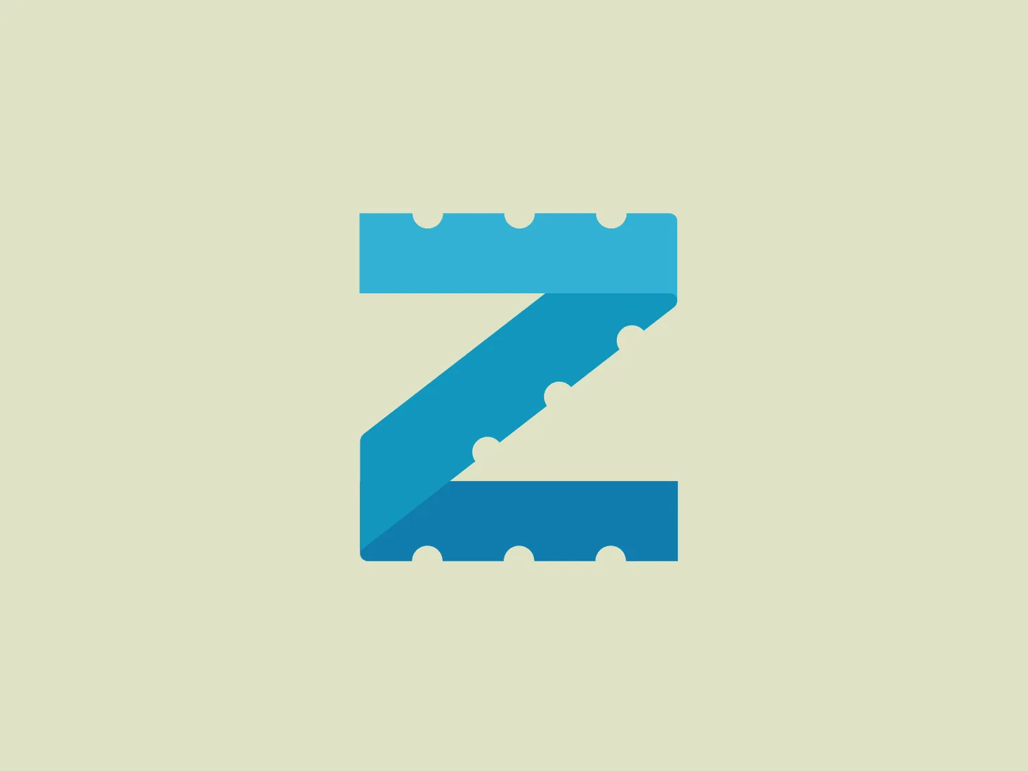
The image depicts a stylized letter "Z" with a modern and digital aesthetic. The letter has a bright cyan to turquoise gradient, giving it a vibrant and dynamic feel. The "Z" consists of two parallelogram shapes, forming the top and bottom strokes, connected by a diagonal stroke, also in the form of a parallelogram. The corners of the parallelograms feature a unique detail that resembles circuit board connectors or digital pixels, which further enhances the tech-inspired look of the design. The simplicity and sharpness of the shapes indicate a contemporary, high-tech brand.

About ZipSeam

ZipSeam offers a convenient and non-invasive solution for modifying shirt fits. The ZipSeam product enables users to customize the fit of their shirts in a matter of minutes, eliminating the need for traditional sewing techniques. This adjustable and reusable solution streamlines the process of achieving an improved fit for clothing.

Similar logos

The Zero Gravity logo features a stylized, abstract letterform that resembles an "S" or a directional arrow. Its linear design is modern and geometric, with clear, angular edges that convey movement and dynamism. The main color of the mark is a bright turquoise, while the outlines and inner shadows are black, adding depth and contrast. The logo displays a three-dimensional quality, made more pronounced by the use of perspective and shading, giving the impression that the figure is lifting off the surface.
The logo for Portify is a stylized letter constructed from geometric shapes with a modern and minimalist design aesthetic. It features a vibrant color palette with cyan, blue, magenta, and yellow, which are layered to create an effect of depth and dimension. The letterform is abstract, consisting of a curved cyan shape on the top right that partially overlaps a stacked arrangement of trapezoidal and triangular shapes in blue, magenta, and yellow. The overall feel of the logo is dynamic and contemporary, suitable for a brand looking to convey innovation and creativity.
The Witness Directory logo features a stylized depiction of a hand within a squared 'D' shape. It is a simple, flat design with a monochromatic scheme, using a vibrant shade of turquoise. The design is minimalist, using negative space effectively to create the fingers of the hand, which are evenly spaced and uniform in width. The overall aesthetic is modern and clean, with a friendly and approachable vibe. Given the color of the logo, a neutral but warm background would complement it well.
The Ciklum logo features a stylized letter "C" created using curved lines or arcs that decrease in size towards the center, evoking a sense of inward motion or a ripple effect. The color gradient ranges from a deep, vivid blue to a bright turquoise, suggesting fluidity and dynamism. The overall design aesthetic is modern, clean, and would likely be associated with technology, communication, or water themes due to its fluid-like appearance. The different shades of blue impart a professional and soothing visual experience.
The Cognito logo features a stylized fingerprint motif composed of white and turquoise lines against a deep blue circular background. The modern, minimalist design incorporates slight gradients that add depth to the lines, which are arranged to mirror the unique swirls and ridges found in a human fingerprint. This suggests individuality and security, making it suitable for technology or security-related branding. The overall aesthetic is clean and digital, with a cool tone that would benefit from a complementary background color.
The Louisville Public Media logo features a simplistic and modern design consisting of three squares arranged in an L-shaped configuration. The top square is a vibrant red (#FF6347), and the other two squares exhibit a cyan (#00FFFF) on the left and a medium blue (#0000CD) on the right. This bold and eye-catching design leverages a primary color scheme, suggesting a confident and balanced identity. The straight edges and equal sizing of the squares create a sense of uniformity and stability, reflecting the business's values.
The Ramsauer logo features a stylized letter "R" contained within a circle. The design is minimalistic, with the right side of the "R" extending beyond its usual form to create a fluid, dynamic look that breaks the circular boundary on the right side, giving the appearance of motion or progress. The color is a rich, bold teal, which stands out with a modern and sleek vibe. The logo's simplicity suggests a contemporary brand identity with an affinity for elegance and innovation.
The logo displayed is a simple yet bold design, consisting of Tradify's stylized letter "T" in a bright, flat cyan color. The "T" features a unique cut on the top right corner, giving it a modern and slightly asymmetrical appearance. This geometric modification adds a sense of movement or evolution to the otherwise traditional letterform. The logo’s clean lines and lack of additional embellishments suggest a minimalist design approach, suitable for contemporary branding. The cyan color is vivid and would stand out effectively against a light pastel background.
The Enigma Holdings logo is a stylized monogram featuring the letter 'E' in a modern, geometric design, with thick, bold lines creating an interlocked 'E'. It is enclosed in a shape reminiscent of a rounded square or softened rectangle. The deep teal or turquoise color exudes sophistication and professionalism. The continuous looping lines emphasize unity and connection, while the design's clean and contemporary vibe would stand out nicely on a complementary background without overpowering it.
The Vancouver Economic Commission's logo is a stylized, abstract design resembling a shield or a stylized letter "V", made of multiple curved lines. It consists of five lines with varying widths, creating a sense of movement and depth, all converging towards the bottom center point. The design has a modern, clean aesthetic with its use of negative space and sharp curves. The logo's bright cyan or turquoise color gives it a fresh and energetic feel, which would be complemented by a subtle and muted background.