Weekendtas

15
The Weekendtas logo cleverly incorporates a shopping bag shape into the letter "W," evoking luxury and style with its minimalistic, modern design.

Weekendtas Logo

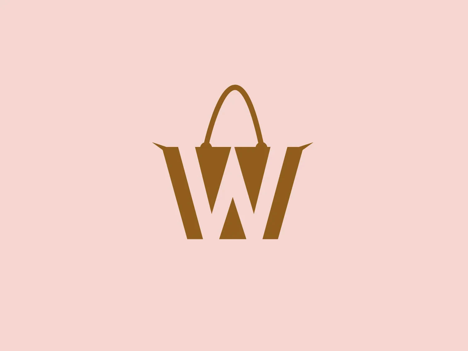
The Weekendtas logo features a stylized representation of a shopping bag combined with the letter "W." The primary shape resembles a tote bag with its open top corners flared outwards, simulating the look of a bag that might be filled with items. The handles of the bag arch gracefully above the opening, while the body of the bag forms the letter "W" in a bold serif font. The color of the logo is a solid, earthy gold, giving it a luxurious and upscale feel. The design is minimalistic and modern, with a clear focus on symmetry and the clever integration of the bag shape with the letter.

About Weekendtas

Weekendtas is a travel accessories company that offers a wide range of products including luggage, backpacks, travel organizers, and travel essentials. The company focuses on providing high-quality, durable products designed for weekend getaways and short trips. Weekendtas emphasizes functionality and style in its product offerings, catering to the needs of travelers looking for practical and trendy travel gear.

Similar logos

The ICICI Bank logo features a stylized, abstract design with a fluid, organic shape. The central element resembles a lowercase "i" with a dot hovering above what could be interpreted as an abstract human figure or a dynamic swirl. Its bold lines curve to create a sense of movement. The color scheme consists of a gradient transition from a deep, warm red to a rich, golden orange, giving the logo an energetic and inviting appearance. Noteworthy is the way the white space between the "i" and its dot creates a pathway, emphasizing the motion and adding an element of negative space to the design.
The Washington Commanders logo features three interconnected diamond shapes forming a stylized letter "W." The primary color is a deep maroon with a thick golden yellow border, creating a sharp contrast and a dynamic feel. The use of geometric shapes and bold colors conveys strength and modernity.
The Oberoi logo features a stylized bloom or sunburst, with a multitude of pointed petals or rays emanating from a central point. It utilizes a two-tone color scheme with shades of gold, giving it a warm, inviting look. The design is symmetrical, suggesting balance and harmony. The overall aesthetic is clean and modern, with a touch of elegance due to the refined curves of each petal and the gradient effect that provides a sense of depth. The simplicity of the design allows for versatility in its application.
The Lorenz Corp. logo showcases a stylized letter "L," designed with dark navy blue lines and edges, creating a bold and pronounced appearance. Intertwined with the "L" is a golden yellow laurel wreath, adding a touch of prestige and victory symbolism. The overall design aesthetic is clean, professional, and evokes a sense of tradition and excellence. The interplay of navy blue and golden yellow creates a strong contrast that is both eye-catching and elegant.
The logo for Marvelous Designer features a simplistic and bold design of two identical, thick, golden-yellow bars arranged diagonally to form an abstract letter 'M'. The negative space between them accentuates the shape of the 'M', while the lack of embellishments gives the logo a modern and minimalistic feel. The bright and attention-grabbing color suggests energy and innovation.
The business logo for Glow Bar is a stylized, modern design portraying the lowercase letter 'g'. The design is fluid and continuous, with a bold, looping structure. The logo is a warm, pale gold color, conveying luxury and elegance, with a glossy finish for a premium feel. A small, five-pointed star sits above the upper curve of the 'g,' suggesting excellence or a premium grade.
The King School logo showcases a dark blue shield with a golden border, exuding a classic and regal aura. A stylized golden kettle with a bold letter "K" at the center represents a possible initial or emblematic symbol of the school. Below the kettle, three five-pointed stars line up horizontally, accompanied by two wavy lines suggesting steam or heat. The prominent display of the year "1865" at the bottom signifies an important founding date or historical reference. The elegant contrast between the golden elements and dark blue background, along with the traditional serif font used for the date, adds to the logo's timeless appeal.
The Calgary Flames logo features a stylized letter "C" in a bold red color with gold and white trim, giving it a three-dimensional appearance. Embedded into the form of the "C" is the profile of a fiery figure, suggestive of a flame with wispy edges in shades of red and orange that evoke a sense of dynamic movement and energy. The flame's outline doubles as the inner stroke of the letter, with small accents of white, enhancing the contrast and detail within the design. This logo exudes a bold and energetic aesthetic, appropriate for a dynamic and spirited brand or team. It has a modern and sleek look with a distinct sense of motion and liveliness.
The Stuller logo features a stylized, abstract letter 'S' with an elegant silhouette. Comprised of two mirrored swirls, the fluid and organic figure is reminiscent of a treble clef or an ornate script letter. The tapered ends add a sense of movement and finesse, while the single muted gold color exudes luxury and sophistication. Perfect for high-end branding, the logo exudes a classic and timeless aesthetic.
The Wake Forest University logo is a modern and minimalist stylized shield with abstract, geometric shapes suggesting strength and protection. Three symmetrical shapes within the shield resemble leaves or flames, converging at the center. The color palette is simple and sophisticated with deep black shapes and a metallic gold outline. The overall aesthetic is clean, sharp, and conveys a feeling of luxury or high-end branding.