Rey Toro

15
What catches our eye is the stylized emblem that combines mountain-like peaks with a shield or arrowhead shape, exuding strength and modernity.

Letter

Color

Gold
104
Navy
133

Rey Toro Logo

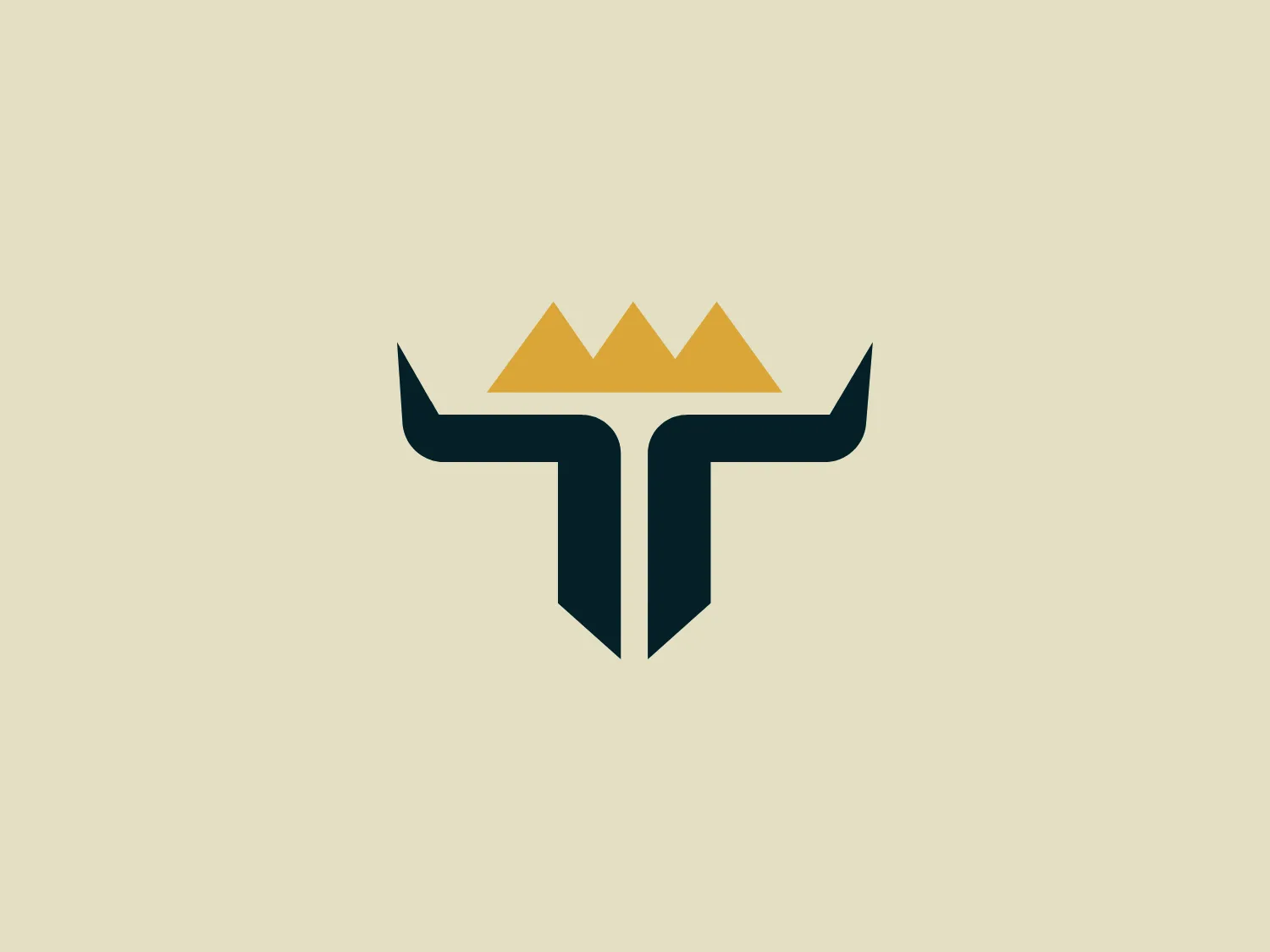
The Rey Toro logo presents a stylized emblem that combines mountain-like peaks with a shield or arrowhead shape at the base. The top portion consists of three connected peaks with the middle one slightly taller, colored in a gradient of golden to lighter gold hues, implying a metallic sheen. Below, the design transitions into a contrasting deep navy or black color, suggesting solidity and professionalism. The overall shape resembles an abstract letter "T" or a bull's horns, exuding strength and stability. The design features clean lines and sharp angles, promoting a modern and minimalist aesthetic.

About Rey Toro

Rey Toro is a company that specializes in providing functional, innovative, and comfortable work clothes and uniforms to empower and inspire a sense of ownership and security among collaborators worldwide. With over a decade of experience in the textile industry, they offer tailored solutions to meet the unique needs of each company.

Similar logos

The Miro logo comprises three bold, stylized, and slightly slanted lines enclosed within a rounded square border. These lines converge at the left, suggesting movement or direction, with the negative space between them indicating a path or choice. The deep navy blue lines create a strong visual contrast against a solid, warm yellow background, exuding a striking and energetic feel. Overall, the design is modern, dynamic, and conveys a sense of innovation and progression.
The Bakkerij Faber logo features a stylized letter "B" with a modern and minimalistic design. It's composed of a single, bold line with a smooth curve delineating its shape. The color of the "B" is a vibrant and warm shade of yellow or gold, conveying a sense of energy and optimism. The overall design aesthetic is clean and contemporary, with no additional embellishments. This simplicity enhances the logo's versatility and readability. Considering the warmth of the gold hue, a subtle and calm background color would complement it well.
The Airbus Ventures logo features two overlapping geometric shapes forming an abstract mountain or a stylized letter "A." The deep navy blue color scheme exudes a professional and modern feel. The first shape is a right-angled triangle with its hypotenuse on the left and the smallest angle pointing downwards. The second shape follows the sloping right side of the triangle and curves inward to form a peak, creating an interlocking effect. This minimalistic design is bold and simple, making the logo versatile and easily recognizable.
The Aircare International logo is a sleek and modern design featuring a dark navy blue color. Three stylized shapes converge to create an abstract representation of a mountain peak or a stylized letter "A". In the center of the peak, a negative space forms a simple, upward-facing airplane, conveying a sense of ascent or progress. The minimalist and clean design exudes professionalism and movement, making it a fitting representation for an organization associated with aviation, travel, or exploration. With a contemporary feel, the logo focuses on precision and forward-thinking.
The logo in the image from Acme United consists of a simplistic yet modern design featuring overlapping letter elements within a circular shape. The primary element appears to be a stylized letter "A" crafted to also resemble a lowercase "b", demonstrating a clever fusion of two characters into one flowing design. The logo is monochrome, with the letter element in a crisp white set against a solid navy blue background. The rounded typography and the circular backdrop create a sense of completeness and unity, while the negative space cleverly conveys dual letters. The minimalist design ensures versatility and readability.
The image shows a minimalist logo composed of a stylized letter "V." The design is sleek and modern, with clean lines and sharp angles. The Vistex logo has a bold, navy blue color that conveys a sense of professionalism and reliability. The "V" has a slightly abstract look, with the arms of the letter converging at the top in a sharp point. The overall aesthetic is of contemporary simplicity and would likely represent a brand that values clarity, precision, and sophistication. Given the dark hue of the Vistex logo, a lighter background would complement it well.
The Viva Wallet logo is a stylized letter 'W' with geometric characteristics. It is composed of two identical, thick, vertical shapes that mimic the letter 'V', placed side by side to form the 'W'. The shapes have slightly rounded bottoms, and their angled tops suggest a subtle serif-like attribute at the opening of the 'W'. The color of the elements is a deep shade of navy blue, which exudes a professional and modern feel. The logo's design is minimalistic and would likely be easy to recognize due to its bold and simple construction.
The Assurex Global logo features an abstract, geometric design composed of triangular formations in two shades of yellow—bright and gold— outlined with a thin, light grey border. The sharp angles and contrast give it a modern, dynamic, and professional look.
The Wall logo features a stylized, abstract design that resembles a mountain or a zigzag, comprised of two symmetrical peaks with a three-dimensional effect. The shapes within are defined by a darker tone and lighter shades, creating a sense of depth. Its color is a deep shade of navy or indigo that conveys sophistication and strength. The overall design is minimalist and modern, with clean lines and sharp angles that suggest precision and innovation. The three-dimensionality adds an element of complexity to an otherwise simple geometric shape.
The Efani logo presents a modern and minimalist design with a series of nested shield shapes that create depth through the use of negative space. The primary feature is a bold, stylized letter "E" in the center, which stands out against the smaller shield shape within the larger one. The color of the logo is a dark navy blue, which conveys professionalism and reliability. Smooth and clean lines give the logo a sleek and contemporary look, indicative of security, protection, or a digital technology brand. Considering the color and design, a light background would complement the logo well.