Kaliido

15
One thing we like is the dynamic use of geometric shapes and vibrant colors in the Kaliido logo, conveying a modern and creative aesthetic.

Kaliido Logo

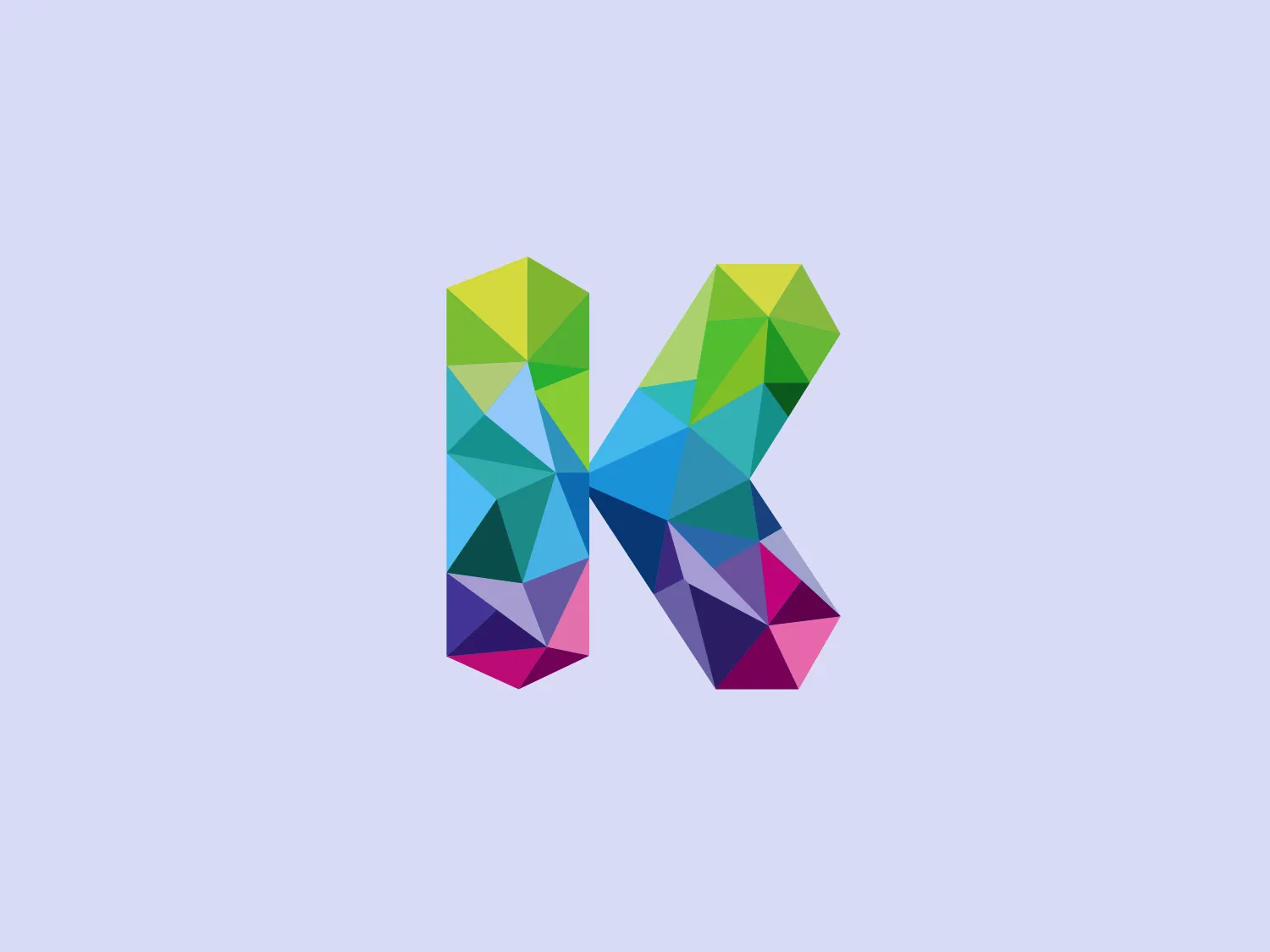
The Kaliido logo showcases a stylized letter "K" crafted from a mosaic of geometric shapes, predominantly triangles. To create a vibrant and diverse color palette, the spectrum ranges from deep purples and blues at the base of the "K" to bright greens and yellows at the top. The design conveys a modern, dynamic aesthetic, hinting at creativity, digital innovation, and technological focus. The triangular facets lend a sense of depth, providing the flat image with a quasi-3D effect.

About Kaliido

Kaliido is a social lifestyle network designed for meaningful connections within the gay community, with a focus on non-adult-related topics. The platform caters to gay men between the ages of 18 and 50, particularly those who are educated, professional, and interested in cultured activities.

Similar logos

The Matsuura logo features a stylized depiction of three overlapping, rounded shapes in a vibrant green color. The design exudes a modern and minimalist aesthetic with a nod to nature or growth themes, implying movement and connectivity. The shapes suggest leaves, pebbles, or abstract representations of increasing value/momentum.
The image depicts the Akku Vertrieb logo with a bold, geometric design primarily using a bright blue color. The logo resembles an abstract depiction of an uppercase 'A' without the crossbar. It consists of three parallelogram shapes that form a stylized 'A' with white lines creating separation between them, adding a dynamic and layered effect. The design is sharp, modern, and conveys a sense of stability and professionalism. The simplicity and use of negative space give it a clean and versatile look, suitable for various applications.
The Kuda Bank logo features a stylized letter 'K' mirrored and joined in the middle to form a symmetrical design that resembles a chevron or arrow pointing to the left. The 'K' shapes are composed of four solid stripes with sharp angles, creating a dynamic and modern look. The color of the logo is a deep, rich purple, giving it a sense of sophistication and regality. There are no additional embellishments, allowing the clean and bold geometry of the letterforms to stand out.
The Mobileye logo features a stylized letter 'n' with a distinct geometric design. It is comprised of bold, straight lines with sharp angles, creating a modern and minimalist aesthetic. The main component of the logo is a deep blue color, giving it a professional and trustworthy feel. The design is simple yet striking, with the use of negative space on the left side that could be interpreted as an abstract arrow or a partial square bracket, which adds an element of dynamism and forward-thinking to the overall design.
The Unilever logo appears to consist of intricate and stylized illustrations forming a shield-like shape. The design features a collection of floral and organic patterns, ranging from leaves and flowers to abstract swirls, all densely packed to create a cohesive emblem. It is monochromatic, using a deep blue color which gives it a classic and professional appearance. The contrast between the negative space and the blue areas creates an engaging and dynamic visual effect, suggesting detail and craftsmanship. The logo has a symmetrical layout that adds to its balanced and harmonious look.
The logo features a bold, uppercase letter 'T' centralized within an oval outline. The 'T' has a modern and sturdy design, presenting straight lines and squared edges that convey a sense of stability and strength. The color of both the 'T' and the oval border is a deep, navy blue, which adds to the professional and authoritative feel of the logo. The oval provides a sense of continuity and enclosure, framing the letter neatly and giving it prominence. There is an adequate amount of space between the 'T' and the oval border, highlighting the letter and making it the focal point. The simplicity of the design allows for versatility and clarity when displayed across various mediums.
The Commodore logo features a large, bold, blue letter "C" that encircles a smaller red shape resembling a right-pointing arrow or a play button symbol. The stark contrast between the blue and red hues creates a striking and modern aesthetic. The absence of additional elements or embellishments underscores a commitment to clarity and efficiency in the design, striking a balance between visual impact and straightforward symbolism.
The Breitling logo depicts a stylized, fluid letter "B" with elongated, curved strokes, giving it an elegant and dynamic appearance. The design is minimalist, using a bold golden yellow color that suggests luxury, quality, and sophistication. The overall aesthetic is modern and sleek, with a sense of movement and possibly creativity, hinted by the smooth lines that evoke a sense of continuity. Given the vibrancy of the golden hue, a subtle and light background would complement it well without competing for attention.
The BitX Capital logo showcases a stylized, abstract design with a dynamic feel. It comprises interlocking shapes resembling a three-dimensional impossible loop. The main elements consist of two intertwined ribbons with a gradation of green shades that provide a sense of depth and movement. The contrast between the lighter and darker greens enhances the interweaving effect. Overall, the logo presents a modern and clean appearance, suggesting innovation and connectivity.
The Subway logo features two bold, interlocking arrows forming an 'S' shape, with the top arrow colored in a striking green and the bottom in a vibrant yellow. The design is clean and modern, with a dynamic sense of movement implied by the arrows pointing in opposite directions. This creates a sense of exchange, circulation, or progression, which might suggest a company involved in logistics, technology, or finance. The flat color treatment and lack of additional embellishments give it a contemporary and straightforward aesthetic.