Greenbook


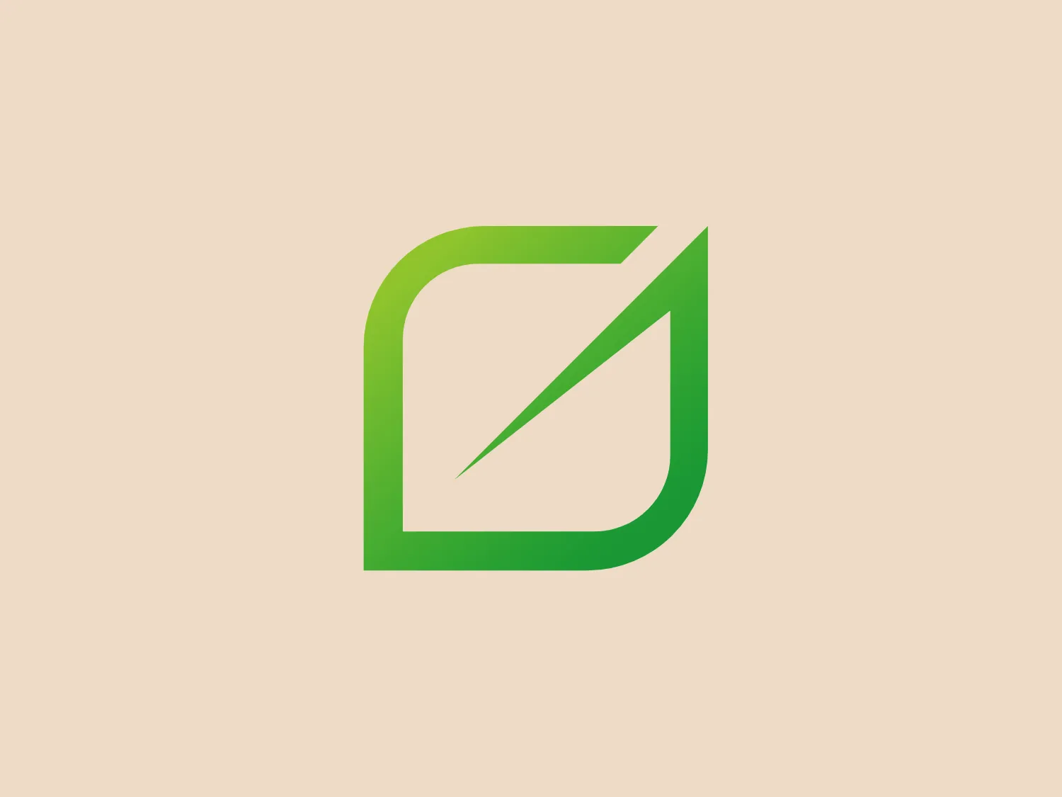
What catches our eye is the sleek and modern stylized geometric design of the Greenbook logo, highlighting innovation and eco-friendliness with its gradient shades of green.
Letter
Type
Color
Style
The Greenbook logo showcases a stylized, geometric design consisting of a singular, abstract shape resembling a square with a rounded corner and a diagonal slash. The modern and sleek look is highlighted by gradient shades of green, from light lime to deep grass green, conveying depth and vitality. Clean lines and the gradient effect communicate innovation and growth, while the aesthetic presents a fresh, contemporary impression with a nod to nature and eco-friendliness.
Greenbook is an online platform that provides data delivery, farm management, and chemical protection services for the agricultural sector.
No items found.
Similar logos
NEW

The Soriana logo features two abstract shapes—a large lime green element on the left, resembling a stylized letter 'S' or a comma, and a smaller, bright red teardrop-shaped element on the right. The two shapes are juxtaposed to create a dynamic and modern appearance, which could suggest movement or interaction. The color contrast between the green and red is vibrant and eye-catching, with the green providing a sense of freshness and growth, while the red could represent passion or energy. The overall design is simple yet impactful, with a clean and contemporary feel. Considering the colors of the logo, a neutral but slightly warm background would complement it without creating excessive contrast.
NEW

The Q Square logo features a bold and stylized letter 'Q' with a chat bubble design, symbolizing communication. The primary squarish shape with rounded corners gives it a modern and friendly appearance. Its vibrant lime green color exudes energy and freshness. The clever use of negative space to form the tail of the 'Q' and integrate it into the square shape adds visual interest. A subtle background color that complements the design is recommended.
NEW

The ThingWorx logo is a geometric design showcasing a stylized hexagon segmented into four diamonds. The two filled with deep slate gray color and the other two with vibrant lime green create a striking contrast, while the symmetrical and balanced design exudes stability. The sharp angles convey a modern and dynamic aesthetic, and the bright green could denote growth or eco-friendliness.
NEW

The Adient logo features a stylized letter "A" with a modern and minimalistic design. The "A" is dark blue, possibly navy, with two lime green horizontal lines slicing through it at an angle, giving the impression that the "A" is moving or has a dynamic presence. The blues and greens create a fresh and contemporary feel, suggesting innovation or technology. The lines are evenly spaced, and their interruptions of the "A" shape add interest and a touch of playfulness to the design, while maintaining a professional look.
NEW

The logo presented for EMS Software is a stylized, geometric design resembling a three-dimensional cube that is twisted to also suggest the letter 'S'. The color palette includes two shades of green: a lighter, lime green for the top and one side, and a deeper, forest green for the other side of the cube, creating a sense of depth. The angles are sharp and precise, giving the logo a modern and dynamic feel. It's a clean and minimalistic design that conveys movement and innovation.
NEW

The Windstream logo is a stylized, abstract design featuring a continuous, wavy line reminiscent of a sine wave or mountain peaks. The sleek, modern aesthetic is highlighted by smooth curves and points, while the vibrant lime green color adds a fresh and energetic appeal. The symmetrical shape suggests balance or rhythm, and the simplicity of the design allows for versatile use across various media.
NEW

The Hadlow College logo features a stylized depiction of green leaves and stems intertwined within two parallel vertical bars, suggesting the letter 'H'. The design employs two shades of green; a lighter, lime green for the leaves and a deeper, forest green for the bars, creating contrast and emphasizing the eco-friendly motif. The curvature of the leaves injects a sense of growth and vitality into the otherwise geometric and structured form of the 'H'. Given the color scheme and nature-inspired elements, the logo exudes an organic and environmentally conscious brand identity. A background color that would complement this logo is a soft, pale pink, which provides a gentle contrast and ensures the greens stand out without overwhelming the viewer.
NEW

The Envisio logo is an abstract, modern design comprised of three swoosh-like shapes that form a circular motion, implying dynamism or rotation. The shapes are smooth and rounded, creating a sense of fluidity and continuity. The color palette includes a dark grey, a vibrant sky blue, and a fresh lime green, which together convey a professional yet energetic and innovative feel. The use of space between the elements gives the logo a clean and uncluttered look, allowing each color to stand out distinctly.
NEW

The Neopost logo features a modern, minimalist design of two geometric shapes—a triangle and a line—arranged to form an abstract letter 'N'. The clean, sharp edges convey precision and efficiency. Its bright lime green color pops against a white background, giving it an energetic and fresh feel. The simplicity and boldness of the design make it versatile and scalable for various applications.
NEW

The Quiznos logo features a stylized letter "Q" depicted in a vibrant, electric lime green color. The "Q" has a modern and minimalist design, with the tail of the letter curving inward rather than extending outward as in traditional fonts. The overall shape of the "Q" is bold and sans-serif, with smooth curves and a circular hollow at the center of the letter. The color contrast is striking with the "Q" set against a solid black square background that frames the shape effectively and gives it a prominent presence. Given its simplicity and boldness, a background that does not distract from the logo would be ideal.