Agacli

15
Here's what we like: The Agacli logo's abstract pyramid shape and modern navy blue shades create a strong and versatile design.

Agacli Logo

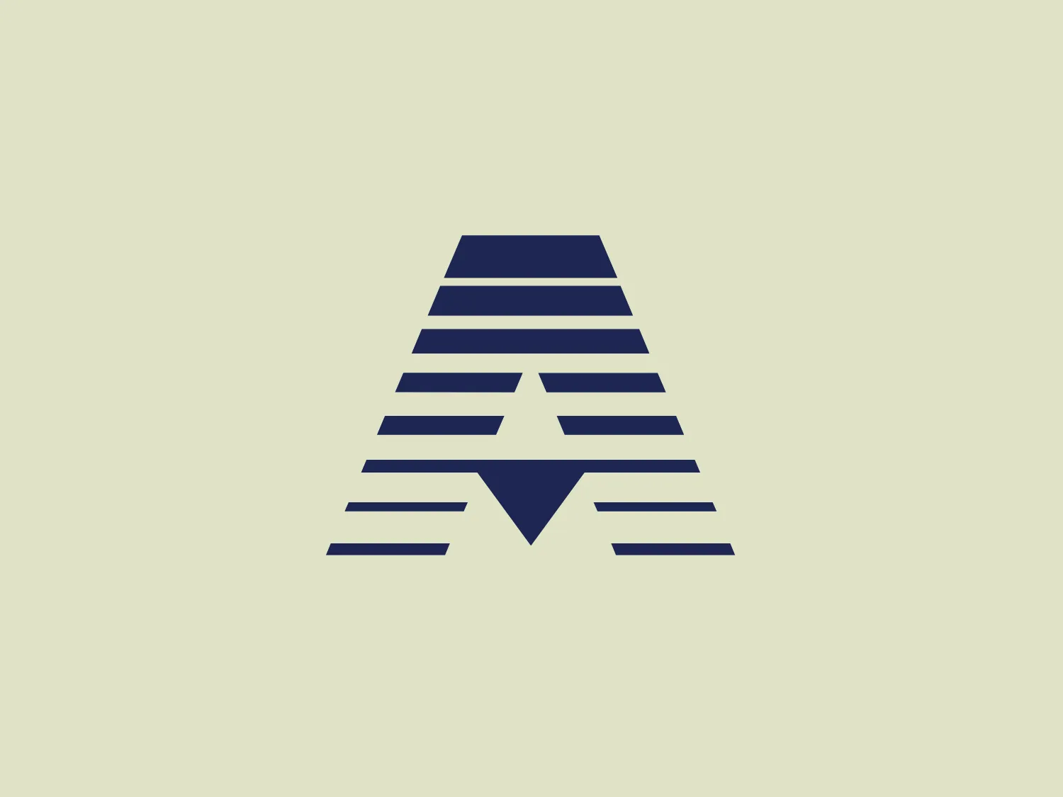
The Agacli logo features a series of horizontal lines forming an abstract pyramid or triangular shape with a stylized "A" at the center. It uses different shades of navy blue to create depth and visual interest, with the darkest color at the top becoming progressively lighter towards the base. The design has a modern and professional aesthetic, with sharp lines and angles that create a sense of stability and strength. The simplicity of the design allows for versatile use across various media. The negative space around the central "A" gives the impression of an upward arrow, symbolizing growth or progress.

About Agacli

Established in 1964, Ağaçlı Group of Companies operates in various sectors such as logistics, automotive, fuel oil, trailer manufacturing, tourism, and insurance services, demonstrating a diverse and extensive business portfolio.

Similar logos

The Basis London logo presents a modern and minimalist stylized combination of geometric shapes that form the letter 'B'. The design consists of intersecting straight lines and curves in a dark blue or navy color, creating an illusion of three-dimensional layering. The negative space within the circular element adds to the overall balance and visual interest of the design.
The Unilever logo appears to consist of intricate and stylized illustrations forming a shield-like shape. The design features a collection of floral and organic patterns, ranging from leaves and flowers to abstract swirls, all densely packed to create a cohesive emblem. It is monochromatic, using a deep blue color which gives it a classic and professional appearance. The contrast between the negative space and the blue areas creates an engaging and dynamic visual effect, suggesting detail and craftsmanship. The logo has a symmetrical layout that adds to its balanced and harmonious look.
The Meeka Metals logo features three stylized mountain peaks within a square frame. The central and left peaks are vibrant orange (#F7DED6), while the right peak and the negative space forming the valley below are a deep navy blue (#D9E5F9), creating a striking contrast. The clean, sharp angles convey modernity and stability, while the geometric approach gives the design a bold character, symbolizing strength and reliability. The overall aesthetic blends adventure and professionalism, showcasing a sense of boldness and stability. Hexcode: #E4E2F8
The Cimaco logo features a modern and abstract design with three concentric circles decreasing in thickness from the outermost to the inner circle. Inside the circles, there is a unique element that seems to be a combination of a dot and a small crescent shape, aligned off-center towards the upper-left quadrant, creating a dynamic and forward-moving appearance. This element interrupts the continuity of the circles on one side, suggesting connectivity or targeting. The color is a solid, deep shade of blue, which conveys professionalism and trustworthiness. Overall, the logo has a clean, tech-savvy look with a minimalist aesthetic. Considering the color and design of the Cimaco logo, a light and neutral background would complement it well.
The Kajabi logo consists of a bold, abstract geometric design forming a stylized letter 'K.' It is composed of two triangles in deep and light blue tones, creating a modern and energetic appearance with a dynamic aesthetic.
The logo in the image displays a symmetrical design resembling an abstract butterfly or a pair of wings. It consists of multiple leaf-like shapes radiating from the center, creating a harmonious pattern. Vibrant colors such as pink, orange, yellow, green, light blue, and teal are used, outlined with a thin black border that enhances their individuality. The overall design aesthetic is lively and organic, suggesting a sense of growth or transformation. The black background makes the colors pop, giving the logo a bold and energetic appearance.
The Airbus Ventures logo features two overlapping geometric shapes forming an abstract mountain or a stylized letter "A." The deep navy blue color scheme exudes a professional and modern feel. The first shape is a right-angled triangle with its hypotenuse on the left and the smallest angle pointing downwards. The second shape follows the sloping right side of the triangle and curves inward to form a peak, creating an interlocking effect. This minimalistic design is bold and simple, making the logo versatile and easily recognizable.
The Mobileye logo features a stylized letter 'n' with a distinct geometric design. It is comprised of bold, straight lines with sharp angles, creating a modern and minimalist aesthetic. The main component of the logo is a deep blue color, giving it a professional and trustworthy feel. The design is simple yet striking, with the use of negative space on the left side that could be interpreted as an abstract arrow or a partial square bracket, which adds an element of dynamism and forward-thinking to the overall design.
The logo presented is a stylized letter "W" formed by the interconnection of three overlapping triangles with rounded corners, conveying a sense of unity and dynamic interaction. The triangles are filled with flat, bold colors—yellow on the left, green in the center, and blue on the right—creating a harmonious yet vibrant palette that suggests creativity and energy. The design aesthetic is modern, minimalistic, and playful, with a friendly and approachable vibe. The lack of borders or outlines and the use of clean, geometric shapes provide a sleek and contemporary feel.
The BorgWarner logo is a stylized abstract mark consisting of geometric shapes resembling arrows or chevrons pointing towards the left and intersecting to form a bold "X" shape. The logo utilizes a strong, monochromatic deep blue color, giving it a professional and modern appearance. It features a series of parallel lines with varying thicknesses, creating a sense of movement and dynamism. With clean lines and sharp angles, the design conveys precision and cutting-edge technology, while the symmetrical arrangement provides balance and stability.