Constellation

15
What we like about the Constellation logo is the use of three curved stripes with gradient color transitions, creating a sense of motion and harmony.

Letter

Color

Blue
1490

Constellation Logo

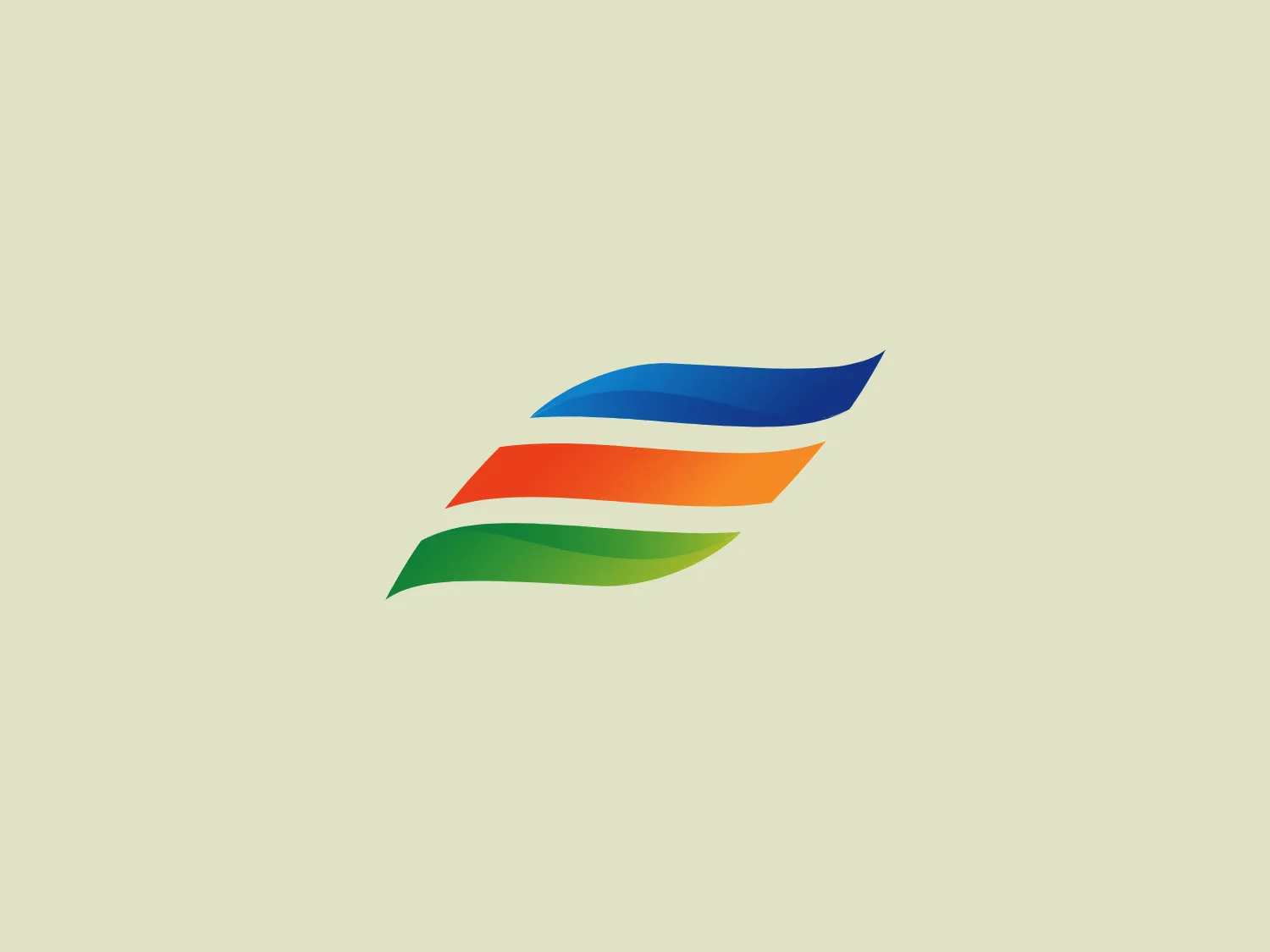
The Constellation logo features three curved stripes with a gradient color transition. The top stripe starts with a deep blue and transitions into a lighter blue, representing a sky or water element. The middle stripe moves through shades of orange to yellow, suggesting energy or a sunrise/sunset theme. The bottom stripe transitions from a leafy green to a lighter green, embodying a sense of growth or nature. Together, these stripes give an impression of motion, fluidity, and harmony in a minimalistic yet dynamic design, possibly suggestive of connectivity or movement. The overall design aesthetic is modern, sleek, and vibrant.

About Constellation

Constellation Energy Corporation is a prominent energy company in the United States that specializes in clean, carbon-free energy production. The company's focus on hydro, wind, solar, and nuclear facilities contributes to a carbon-free future, powering the equivalent of 15 million homes annually.

Similar logos

The Lazada logo features a stylized three-dimensional shape reminiscent of a cube with a portion of its structure removed or invisible, creating an open corner perspective. It consists of two visible faces, with the left face in a vibrant orange and the right face in a hot pink, employing a gradient that combines the two colors seamlessly at the edge where they meet. The use of color and shading gives the logo a luminous, dynamic look, evoking a sense of innovation and modernity. There are subtle highlights and shadows on the faces that suggest depth and dimensionality. The overall design aesthetic is minimalist, bold, and contemporary, with a playful twist on geometric representation.
The Matsuura logo features a stylized depiction of three overlapping, rounded shapes in a vibrant green color. The design exudes a modern and minimalist aesthetic with a nod to nature or growth themes, implying movement and connectivity. The shapes suggest leaves, pebbles, or abstract representations of increasing value/momentum.
The Mobileye logo features a stylized letter 'n' with a distinct geometric design. It is comprised of bold, straight lines with sharp angles, creating a modern and minimalist aesthetic. The main component of the logo is a deep blue color, giving it a professional and trustworthy feel. The design is simple yet striking, with the use of negative space on the left side that could be interpreted as an abstract arrow or a partial square bracket, which adds an element of dynamism and forward-thinking to the overall design.
The Cornerstone logo features a simplistic and modern design, consisting of a stylized, abstract shape that somewhat resembles a flower or starburst within a circle. The primary element is a brilliant, solid red-orange color that gives the logo a vibrant and energetic feel. The inner white shape has softened edges which contrast smoothly with the circular boundary. Its symmetry and clean lines convey a sense of balance and professionalism. Considering the color palette of the logo, a soft, neutral background color would complement it well without competing for attention.
The image depicts the Akku Vertrieb logo with a bold, geometric design primarily using a bright blue color. The logo resembles an abstract depiction of an uppercase 'A' without the crossbar. It consists of three parallelogram shapes that form a stylized 'A' with white lines creating separation between them, adding a dynamic and layered effect. The design is sharp, modern, and conveys a sense of stability and professionalism. The simplicity and use of negative space give it a clean and versatile look, suitable for various applications.
The Unilever logo appears to consist of intricate and stylized illustrations forming a shield-like shape. The design features a collection of floral and organic patterns, ranging from leaves and flowers to abstract swirls, all densely packed to create a cohesive emblem. It is monochromatic, using a deep blue color which gives it a classic and professional appearance. The contrast between the negative space and the blue areas creates an engaging and dynamic visual effect, suggesting detail and craftsmanship. The logo has a symmetrical layout that adds to its balanced and harmonious look.
The WildBrain logo features three stylized, abstract figures in various shades of blue, resembling a trio of birds or perhaps aquatic creatures, positioned side by side with their body shapes converging at the base. The figures have a minimalist look, with a smooth, rounded top edge that tapers down to a point. Each figure also contains a simple, circular black eye, adding a touch of character and life to the design. The shapes are devoid of intricate details, favoring a clean and modern aesthetic. Considering the cool blue tones, a soft, contrasting background color would complement the logo without overpowering it.
The Basis London logo presents a modern and minimalist stylized combination of geometric shapes that form the letter 'B'. The design consists of intersecting straight lines and curves in a dark blue or navy color, creating an illusion of three-dimensional layering. The negative space within the circular element adds to the overall balance and visual interest of the design.
The Telstra logo features a stylized uppercase letter "T" in bold, sans-serif font, and an abstract oval-like shape underneath. The vivid blue of the "T" exudes professionalism and trust, while the warm coral red of the shape adds a dynamic and energetic feel. The modern, simplistic aesthetic is characterized by clean lines and curves suggesting movement or stability. The red shape resembles a swoosh or pathway, implying progress or a journey.
The Yatirim Finansman logo depicts a stylized, abstract design that looks like a combination of geometric shapes creating an optical illusion. The shape recalls a three-dimensional cube or box, with elements appearing to interlock. The logo uses two tones of a dark blue palette that give it depth and contrast. The design is modern, clean, and appears dynamic due to its contrasting planes that suggest movement or rotation. It would stand out crisply against a light background that doesn't compete with its color intensity.