Volia

15
The Volia logo features vibrant overlapping shapes with an organic, minimalist design, creating a sense of integration and bold visual impact.

Volia Logo

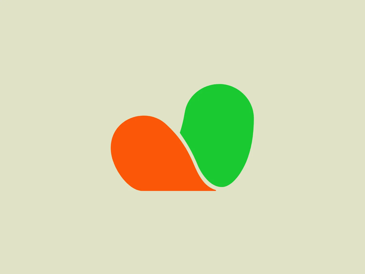
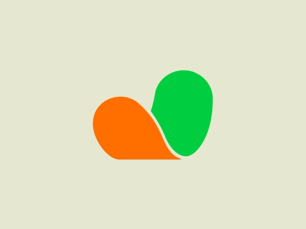
The Volia logo consists of two overlapping shapes with a modern and minimalist design. The shape on the left is a vibrant orange, while the right shape is a lively green. Their forms are organic and rounded, resembling leaves or speech bubbles, which may imply themes of growth, sustainability, or communication. The point where they overlap creates a new blended color, suggesting integration or interaction between two entities or ideas. The simplicity of the design allows for versatility in use, and its bold colors make it stand out.

About Volia

VOLIA is a leading telecommunications provider in Ukraine, offering a wide range of services including analog, digital, HD, and interactive television, high-speed internet access, as well as the services of one of the largest data centers in the country.

Similar logos

The Deliveroo logo features a stylized, geometric representation of a lowercase letter 'v' with rounded terminals and a playful, cut-in contour on the right side. This creates a sense of motion or a smiling face with two dots representing eyes. The bright, aqua-green color gives the logo a modern, minimalist, and friendly vibe, suggesting creativity and innovation.
The Meeka Metals logo features three stylized mountain peaks within a square frame. The central and left peaks are vibrant orange (#F7DED6), while the right peak and the negative space forming the valley below are a deep navy blue (#D9E5F9), creating a striking contrast. The clean, sharp angles convey modernity and stability, while the geometric approach gives the design a bold character, symbolizing strength and reliability. The overall aesthetic blends adventure and professionalism, showcasing a sense of boldness and stability. Hexcode: #E4E2F8
The Afirme logo features an abstract design with three stylized, pointed shapes that resemble peaks or arrows, arranged in a dynamic and ascending pattern. The primary color used is a rich, flat green, without any gradients or shades, which conveys a sense of growth, vitality, or eco-friendliness. The overall aesthetic is modern and minimalist, with clean lines and sharp angles creating a sense of forward movement and progress. The simplicity of the design ensures versatility and readability across various mediums. For this logo, a light and subtle background would complement it well without overwhelming its simplicity.
The Matsuura logo features a stylized depiction of three overlapping, rounded shapes in a vibrant green color. The design exudes a modern and minimalist aesthetic with a nod to nature or growth themes, implying movement and connectivity. The shapes suggest leaves, pebbles, or abstract representations of increasing value/momentum.
The logo in the image displays a symmetrical design resembling an abstract butterfly or a pair of wings. It consists of multiple leaf-like shapes radiating from the center, creating a harmonious pattern. Vibrant colors such as pink, orange, yellow, green, light blue, and teal are used, outlined with a thin black border that enhances their individuality. The overall design aesthetic is lively and organic, suggesting a sense of growth or transformation. The black background makes the colors pop, giving the logo a bold and energetic appearance.
The Monday logo boasts a minimalist design with three simple geometric shapes, exuding a modern and playful aesthetic. It showcases two oblong shapes, one vibrant pink and the other bright yellow, slightly slanted and positioned in parallel, hinting at forward motion or connectivity. A small, solid green circle sits below them to the right, providing a visual anchor and adding a touch of contrast. The clean lines and bold, primary colors infuse the logo with a sense of approachability and energy.
The logo presented is a stylized letter "W" formed by the interconnection of three overlapping triangles with rounded corners, conveying a sense of unity and dynamic interaction. The triangles are filled with flat, bold colors—yellow on the left, green in the center, and blue on the right—creating a harmonious yet vibrant palette that suggests creativity and energy. The design aesthetic is modern, minimalistic, and playful, with a friendly and approachable vibe. The lack of borders or outlines and the use of clean, geometric shapes provide a sleek and contemporary feel.
The ProcureTech logo features a stylized lowercase "p" consisting of bold, continuous lines with rounded corners. The design is minimalist and modern, with a focus on clean geometry and symmetry. The color of the symbol is a vibrant, leafy green, giving it an energetic and fresh appearance. No additional elements or embellishments are present, emphasizing the brand's straightforward and sleek aesthetic.
The Sunny Recruitment logo features a stylized, abstract mark composed of two swirling forms that intertwine, creating a dynamic and fluid motion. The shapes suggest a sense of continuity and interconnectivity. The color gradient transitions smoothly from a warm, vivid red at one end to a deep, soft orange at the other end, conveying energy and passion. The overall design aesthetic is modern, sleek, and appears to be easily recognizable. The use of negative space between the two forms creates a visual pause and adds a layer of sophistication to the design.
The image features a minimalist logo design for Aura Light, consisting of a stylized green lowercase "i" without the dot. The letter is composed of two shapes: a long, vertical pill-shaped rectangle for the body, and a perfect circle for the dot, which is placed detached and to the bottom right of the rectangle. The color of the shapes is a flat, vibrant green that implies freshness and growth. The aesthetic is modern and sleek, implying a brand identity that values simplicity and contemporary design. There is no additional ornamentation, suggesting a direct and accessible approach to branding.