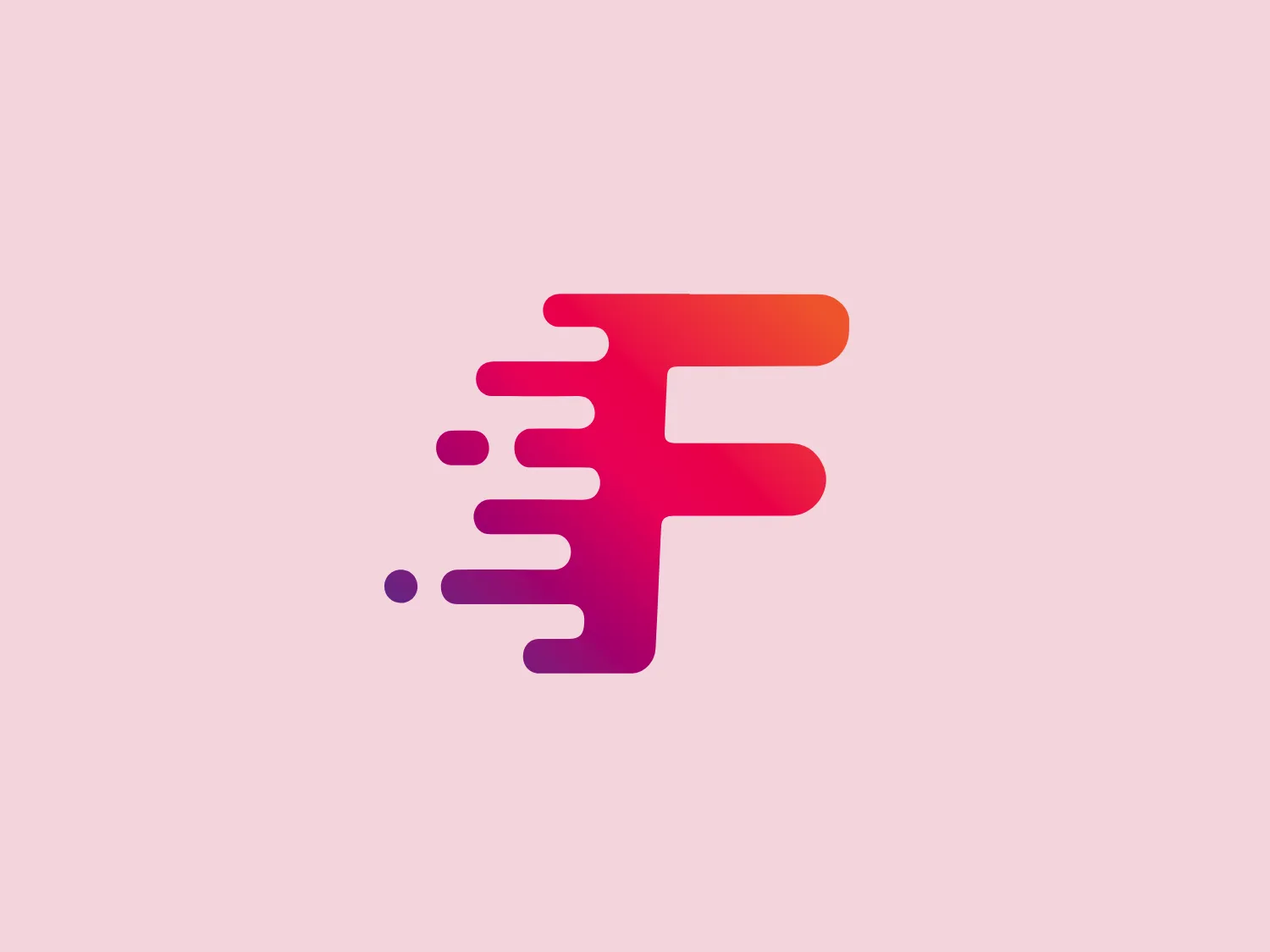
Flexi Analyst

15
What catches our eye is the dynamic, speed-inspired design of the stylized 'F' in the Flexi Analyst logo, suggesting motion, agility, and digital connectivity.

Flexi Analyst Logo

The Flexi Analyst logo showcases a stylized 'F' with a dynamic, speed-inspired design. Composed of solid and gradient elements transitioning from deep purple at the bottom to hot pink and vibrant orange at the top, it suggests motion and agility. The right side extends into fading horizontal lines, amplifying the sense of speed and digital connectivity. This modern, energetic design is suitable for technology or media companies, featuring a bold and fluid shape for clear brand recognition.

About Flexi Analyst

Champ Team, led by a leadership team with extensive experience in leading companies such as Accenture, Amazon, Flipkart, Apple, and Inmobi, is focused on establishing the world's largest community of analysts. The company prioritizes customer value by providing high-quality data and content analysis, aiming to streamline and simplify the lives of its customers.

Similar logos

The Lazada logo features a stylized three-dimensional shape reminiscent of a cube with a portion of its structure removed or invisible, creating an open corner perspective. It consists of two visible faces, with the left face in a vibrant orange and the right face in a hot pink, employing a gradient that combines the two colors seamlessly at the edge where they meet. The use of color and shading gives the logo a luminous, dynamic look, evoking a sense of innovation and modernity. There are subtle highlights and shadows on the faces that suggest depth and dimensionality. The overall design aesthetic is minimalist, bold, and contemporary, with a playful twist on geometric representation.
The Cornerstone logo features a simplistic and modern design, consisting of a stylized, abstract shape that somewhat resembles a flower or starburst within a circle. The primary element is a brilliant, solid red-orange color that gives the logo a vibrant and energetic feel. The inner white shape has softened edges which contrast smoothly with the circular boundary. Its symmetry and clean lines convey a sense of balance and professionalism. Considering the color palette of the logo, a soft, neutral background color would complement it well without competing for attention.
The Kuda Bank logo features a stylized letter 'K' mirrored and joined in the middle to form a symmetrical design that resembles a chevron or arrow pointing to the left. The 'K' shapes are composed of four solid stripes with sharp angles, creating a dynamic and modern look. The color of the logo is a deep, rich purple, giving it a sense of sophistication and regality. There are no additional embellishments, allowing the clean and bold geometry of the letterforms to stand out.
The logo presents a stylized circular shape with a smaller circle connected to its upper right, resembling an abstract representation of a person or a molecule. The main circle has an even, hollow center, contributing to the minimalist design. The design is composed of a solid, deep purple color, giving it a professional and modern appearance. The logo for Fresco's simplicity makes it versatile and easily recognizable. The absence of additional elements ensures the focus remains on this unique, clean geometric form.
The Chainalysis logo features a bold, minimalistic design with interlocking shapes. The primary shape is a circle, within which three curved elements intertwine in a trefoil knot-like configuration, suggesting motion and connectivity. The logo is a vibrant, solid orange color, conveying energy and creativity. The thick lines and smooth curves contribute to a modern and dynamic aesthetic, appearing abstract yet conveying a sense of unity and continuity.
The Prodigy logo showcases a contemporary, fluid lowercase 'p' in a striking orange color. The design features soft curves and a dynamic loop, along with a sharp cut in the descender, creating a modern and slightly abstract appearance. This clean and minimalistic logo exudes energy and approachability while the vibrant orange color conveys creativity and enthusiasm.
The Marberg logo features a stylized, geometric design made of three parallelograms arranged to create a sense of perspective and three-dimensionality. The shapes are aligned to give an impression of depth, with the largest at the front and the smallest at the back. It uses a solid, dark purplish color for the shapes, which adds to its modern and sophisticated aesthetic. The simplicity of the Marberg logo makes it versatile and easily recognizable.
The Banreservas logo showcases a capitalized letter "R" in a dark grey tone using a modern, bold sans-serif typeface. Below the "R," three curved swooshes flow to the left, colored in gradients of light blue, blue, and orange, creating a dynamic contrast. The design presents a clean, contemporary look that suggests energy, speed, or growth.
The Meralco logo features a stylized, angular lightning bolt in white, cutting dynamically across a vibrant, solid orange circle. The bolt itself has sharp edges and points, conveying a sense of energy and power. The simplicity of the design gives it a modern and impactful aesthetic, as the high-contrast color scheme makes the logo stand out boldly. The circular shape envelops the bolt, suggesting completeness and a global or universal aspect to the brand identity.
The image is a stylized logo that appears to represent the letter "B." The design consists of a bold, orange-colored main body with dynamic lines and curves, suggesting movement and energy. The logo has a modern and sleek aesthetic, with the lighter shades creating a gradient effect that adds depth to the design. The lines converge at the lower-left point of the "B," emphasizing speed and direction. This dynamic logo design would stand out nicely against a subtle and clean background.