Xposure Music

15
The bright, abstract geometric design of the Xposure Music logo evokes energy and modernity, standing out with its vibrant colors against a black background.

Xposure Music Logo

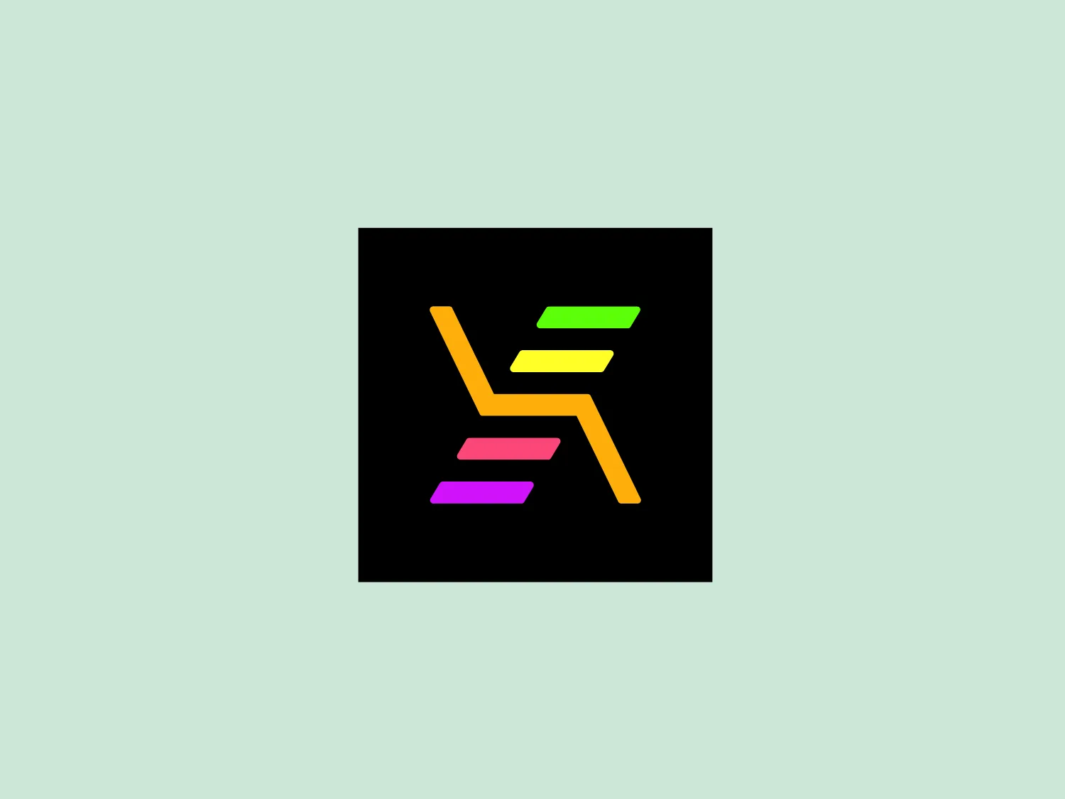
The Xposure Music logo features a stylized, abstract design, composed of colorful, overlapping geometric shapes that resemble a letter or symbol. Its sharp angles and lines suggest motion and modernity. The colors within the design include neon green, bright yellow, electric pink, and vivid orange, which boldly contrast against the black background. This combination gives the logo a vibrant and energetic look, evoking a sense of innovation and cutting-edge appeal. The minimal use of shapes and the strategic use of negative space make the Xposure Music logo easily scalable and distinctive.

About Xposure Music

Xposure Music provides a platform for artist development, offering personalized feedback and mentorship from industry professionals. Musicians have the opportunity to connect with A&Rs, marketers, producers, and managers from top labels, while professionals gain access to new talent.

Similar logos

The Deliveroo logo features a stylized, geometric representation of a lowercase letter 'v' with rounded terminals and a playful, cut-in contour on the right side. This creates a sense of motion or a smiling face with two dots representing eyes. The bright, aqua-green color gives the logo a modern, minimalist, and friendly vibe, suggesting creativity and innovation.
The Meeka Metals logo features three stylized mountain peaks within a square frame. The central and left peaks are vibrant orange (#F7DED6), while the right peak and the negative space forming the valley below are a deep navy blue (#D9E5F9), creating a striking contrast. The clean, sharp angles convey modernity and stability, while the geometric approach gives the design a bold character, symbolizing strength and reliability. The overall aesthetic blends adventure and professionalism, showcasing a sense of boldness and stability. Hexcode: #E4E2F8
The Afirme logo features an abstract design with three stylized, pointed shapes that resemble peaks or arrows, arranged in a dynamic and ascending pattern. The primary color used is a rich, flat green, without any gradients or shades, which conveys a sense of growth, vitality, or eco-friendliness. The overall aesthetic is modern and minimalist, with clean lines and sharp angles creating a sense of forward movement and progress. The simplicity of the design ensures versatility and readability across various mediums. For this logo, a light and subtle background would complement it well without overwhelming its simplicity.
The Gearbest logo features a bold, black, stylized smile at its center, with the ends of the smile tapering to points. This simplistic and cheerful smile is prominently positioned against a vibrant yellow square background with rounded corners. The overall design aesthetic is modern and minimalistic, suggesting friendliness and positivity. The design's high contrast and simplicity would stand out well against a variety of backgrounds but would be particularly striking on a light, muted color to maintain its vibrancy without overwhelming its simplicity.
The Matsuura logo features a stylized depiction of three overlapping, rounded shapes in a vibrant green color. The design exudes a modern and minimalist aesthetic with a nod to nature or growth themes, implying movement and connectivity. The shapes suggest leaves, pebbles, or abstract representations of increasing value/momentum.
The logo in the image displays a symmetrical design resembling an abstract butterfly or a pair of wings. It consists of multiple leaf-like shapes radiating from the center, creating a harmonious pattern. Vibrant colors such as pink, orange, yellow, green, light blue, and teal are used, outlined with a thin black border that enhances their individuality. The overall design aesthetic is lively and organic, suggesting a sense of growth or transformation. The black background makes the colors pop, giving the logo a bold and energetic appearance.
The Monday logo boasts a minimalist design with three simple geometric shapes, exuding a modern and playful aesthetic. It showcases two oblong shapes, one vibrant pink and the other bright yellow, slightly slanted and positioned in parallel, hinting at forward motion or connectivity. A small, solid green circle sits below them to the right, providing a visual anchor and adding a touch of contrast. The clean lines and bold, primary colors infuse the logo with a sense of approachability and energy.
The logo presented is a stylized letter "W" formed by the interconnection of three overlapping triangles with rounded corners, conveying a sense of unity and dynamic interaction. The triangles are filled with flat, bold colors—yellow on the left, green in the center, and blue on the right—creating a harmonious yet vibrant palette that suggests creativity and energy. The design aesthetic is modern, minimalistic, and playful, with a friendly and approachable vibe. The lack of borders or outlines and the use of clean, geometric shapes provide a sleek and contemporary feel.
The Miro logo comprises three bold, stylized, and slightly slanted lines enclosed within a rounded square border. These lines converge at the left, suggesting movement or direction, with the negative space between them indicating a path or choice. The deep navy blue lines create a strong visual contrast against a solid, warm yellow background, exuding a striking and energetic feel. Overall, the design is modern, dynamic, and conveys a sense of innovation and progression.
The Qmedics logo showcases a stylized letter Q in a 3D ribbon-like form with smooth, flowing curves. It incorporates warm red and pink tones transitioning to cooler purples and blues on the interior, creating a vibrant and energetic look. The modern, playful design uses gradients to convey depth and movement, evoking an aesthetic of creativity and dynamism.