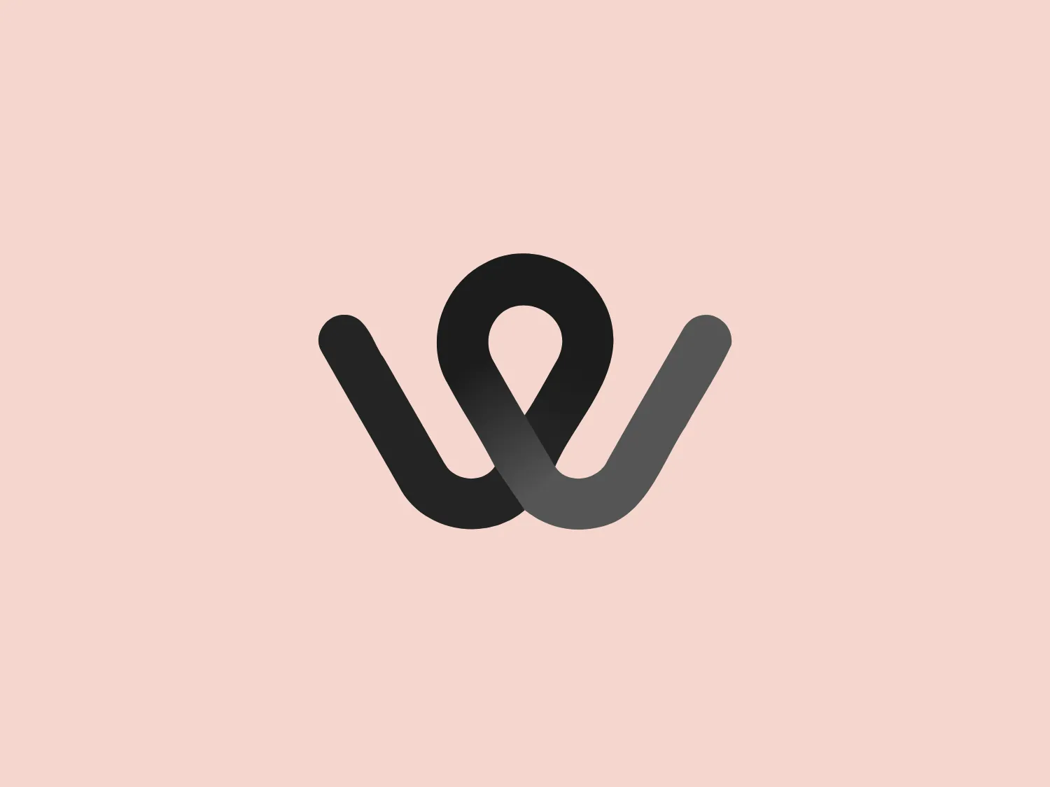
Wiserr Travel


What catches our eye is the fluid, continuous line forming a lowercase "w" with a seamless gradient, evoking innovation and vibrancy.
Letter
Type
Color
Style
The Wiserr Travel logo is a contemporary, fluid design that incorporates a stylized, continuous line forming a lowercase "w". It showcases a gradient that seamlessly transitions from a deep violet to a magenta-pink, culminating in a vibrant golden-yellow, evoking dynamism and innovation. The consistent thickness of the line and its rounded ends lend a friendly and approachable feel to the logo. Additionally, the line's curvature forms a loop at the top center, adding a unique element to the design.
Wiserr is an innovative app designed to promote sustainable travel and support local economies. The app aims to assist cities and towns in evolving into smart destinations, ultimately enhancing the experience for both residents and travelers.
No items found.
Similar logos
NEW

The Lazada logo features a stylized three-dimensional shape reminiscent of a cube with a portion of its structure removed or invisible, creating an open corner perspective. It consists of two visible faces, with the left face in a vibrant orange and the right face in a hot pink, employing a gradient that combines the two colors seamlessly at the edge where they meet. The use of color and shading gives the logo a luminous, dynamic look, evoking a sense of innovation and modernity. There are subtle highlights and shadows on the faces that suggest depth and dimensionality. The overall design aesthetic is minimalist, bold, and contemporary, with a playful twist on geometric representation.
NEW

The Breitling logo depicts a stylized, fluid letter "B" with elongated, curved strokes, giving it an elegant and dynamic appearance. The design is minimalist, using a bold golden yellow color that suggests luxury, quality, and sophistication. The overall aesthetic is modern and sleek, with a sense of movement and possibly creativity, hinted by the smooth lines that evoke a sense of continuity. Given the vibrancy of the golden hue, a subtle and light background would complement it well without competing for attention.
NEW

The Subway logo features two bold, interlocking arrows forming an 'S' shape, with the top arrow colored in a striking green and the bottom in a vibrant yellow. The design is clean and modern, with a dynamic sense of movement implied by the arrows pointing in opposite directions. This creates a sense of exchange, circulation, or progression, which might suggest a company involved in logistics, technology, or finance. The flat color treatment and lack of additional embellishments give it a contemporary and straightforward aesthetic.
NEW

The Nationale Nederlanden logo exhibits a modern and dynamic design, featuring a stylized letter "N" enclosed within a circular shape. The minimalist "N" showcases sharp angles and a bold presence, with a gradient color scheme transitioning from vibrant orange to deep yellow, evoking energy and innovation. The circular background lends a sense of inclusivity or a global perspective, while the clean lines and digital feel make it suitable for a brand associated with technology, creativity, or communication.
NEW

The Kelloggs logo is a stylized letter "K," rendered in a vibrant, solid pink/magenta color. Its design is fluid and modern, with smooth, flowing lines and tapered ends that suggest speed and dynamism. The "K" seems calligraphic, with characteristics reminiscent of a brush stroke or a signature. The design aesthetic is sleek and minimalist, appealing to contemporary sensibilities while maintaining a sense of individuality and flair. Given its color and design, a contrasting yet subtle background color would complement it well.
NEW

The Windesheim logo features a bold, modern design of a stylized letter "W" with sharp angles and a two-dimensional appearance. It is a vibrant, solid yellow color, creating a strong visual presence that is immediately eye-catching. The minimalist aesthetic and contemporary feel are accentuated by the use of a single bright color. The logo's angles convey a sense of movement and dynamism, resonating well with brands seeking to convey innovation or energy.
NEW

The Shangri-La Group logo features a stylized, abstract design consisting of smooth, curvilinear shapes. It is composed of golden yellow lines that form a central symbol reminiscent of a bird in flight or a leaf, enclosed within a perfect circle. The lines are bold and flowing, creating a sense of movement and harmony. The overall aesthetic is modern, minimalistic, and organic, suggesting elegance, freedom, or growth. The simplicity of the design allows for versatile use across various media.
NEW

The Boonli logo features a stylized, continuous loop resembling an abstract figure-eight or infinity symbol. It consists of two intertwined segments with a gradient color transition, starting from a rich magenta on one end, blending into a deep violet, and finishing with a vibrant orange on the other extremity. The colors give it a dynamic and modern feel, while the smooth curves suggest fluidity and connection. This design is sleek and minimalistic, with no additional embellishments, making it versatile and easily recognizable.
NEW

The logo presents a dynamic swirl with a gradient transition from a deep orange to a bright yellow, representing movement or energy. The design resembles a stylized sun or a spinning object with rounded triangular shapes emanating outward, simulating rays or rotation. The overall design aesthetic is modern and vibrant, invoking feelings of creativity, warmth, and motion. The smooth transition of colors gives it a sleek, gradient look that could imply heat, speed, or innovation. The Logo for Grafana Labs.
NEW

The Webster Bank logo features a stylized letter "W" composed of two overlapping chevron shapes in a bold yellow color, set against a white background enclosed within a thick blue circular border. The design aesthetic is modern and minimalistic, with the use of sharp angles and clean lines conveying a sense of dynamism and forward movement. The simplicity and contrast between the yellow and blue make the logo stand out and easily recognizable. The design effectively balances negative space within the "W" to create a sense of depth and layering.