Hexagon Design Studios

15
What we like about the logo is its modern, abstract design featuring intertwined hexagonal shapes creating a dynamic and innovative appearance.

Letter

Color

Blue
1490

Hexagon Design Studios Logo

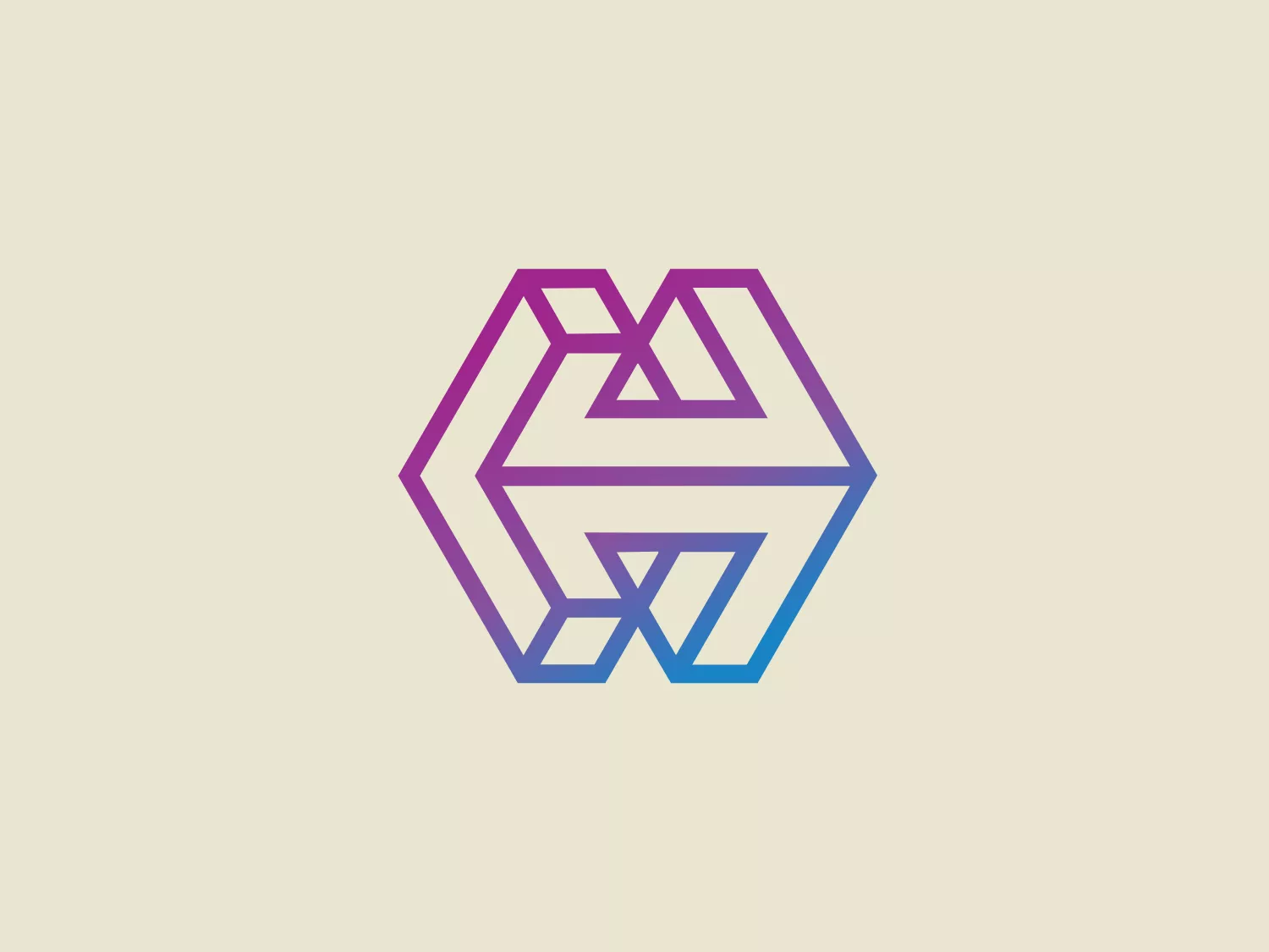
The logo presented features a modern, abstract design, comprising geometric hexagonal shapes intertwined to create what appears to be an impossible figure akin to a three-dimensional optical illusion. The design employs a gradient of colors, transitioning smoothly from a rich purple on the upper left to a cooler blue on the bottom right, giving the Hexagon Design Studios logo a vibrant and dynamic appearance. The interplay of lines and shades produces a sense of depth and complexity, while the symmetry ensures a balanced and harmonious look. Its sleek and contemporary aesthetic suggests innovation and creativity.

About Hexagon Design Studios

Hexagon Design Studios specializes in creating high-quality miniatures, accessories, and conversion components for tabletop wargaming, role-playing enthusiasts, model collectors, and miniature railway hobbyists. The company aims to cater to a wide range of interests and ensure customer satisfaction through premium products.

Similar logos

The image depicts the Akku Vertrieb logo with a bold, geometric design primarily using a bright blue color. The logo resembles an abstract depiction of an uppercase 'A' without the crossbar. It consists of three parallelogram shapes that form a stylized 'A' with white lines creating separation between them, adding a dynamic and layered effect. The design is sharp, modern, and conveys a sense of stability and professionalism. The simplicity and use of negative space give it a clean and versatile look, suitable for various applications.
The Mobileye logo features a stylized letter 'n' with a distinct geometric design. It is comprised of bold, straight lines with sharp angles, creating a modern and minimalist aesthetic. The main component of the logo is a deep blue color, giving it a professional and trustworthy feel. The design is simple yet striking, with the use of negative space on the left side that could be interpreted as an abstract arrow or a partial square bracket, which adds an element of dynamism and forward-thinking to the overall design.
The Kuda Bank logo features a stylized letter 'K' mirrored and joined in the middle to form a symmetrical design that resembles a chevron or arrow pointing to the left. The 'K' shapes are composed of four solid stripes with sharp angles, creating a dynamic and modern look. The color of the logo is a deep, rich purple, giving it a sense of sophistication and regality. There are no additional embellishments, allowing the clean and bold geometry of the letterforms to stand out.
The Commodore logo features a large, bold, blue letter "C" that encircles a smaller red shape resembling a right-pointing arrow or a play button symbol. The stark contrast between the blue and red hues creates a striking and modern aesthetic. The absence of additional elements or embellishments underscores a commitment to clarity and efficiency in the design, striking a balance between visual impact and straightforward symbolism.
The Unilever logo appears to consist of intricate and stylized illustrations forming a shield-like shape. The design features a collection of floral and organic patterns, ranging from leaves and flowers to abstract swirls, all densely packed to create a cohesive emblem. It is monochromatic, using a deep blue color which gives it a classic and professional appearance. The contrast between the negative space and the blue areas creates an engaging and dynamic visual effect, suggesting detail and craftsmanship. The logo has a symmetrical layout that adds to its balanced and harmonious look.
The logo presents a stylized circular shape with a smaller circle connected to its upper right, resembling an abstract representation of a person or a molecule. The main circle has an even, hollow center, contributing to the minimalist design. The design is composed of a solid, deep purple color, giving it a professional and modern appearance. The logo for Fresco's simplicity makes it versatile and easily recognizable. The absence of additional elements ensures the focus remains on this unique, clean geometric form.
The Marberg logo features a stylized, geometric design made of three parallelograms arranged to create a sense of perspective and three-dimensionality. The shapes are aligned to give an impression of depth, with the largest at the front and the smallest at the back. It uses a solid, dark purplish color for the shapes, which adds to its modern and sophisticated aesthetic. The simplicity of the Marberg logo makes it versatile and easily recognizable.
The Banreservas logo showcases a capitalized letter "R" in a dark grey tone using a modern, bold sans-serif typeface. Below the "R," three curved swooshes flow to the left, colored in gradients of light blue, blue, and orange, creating a dynamic contrast. The design presents a clean, contemporary look that suggests energy, speed, or growth.
The Valvoline logo features a stylized letter 'V' composed of two diagonally opposite chevrons. The left chevron is filled with a vibrant red color, while the right chevron sports a deep blue hue. Both chevrons are set against a plain white background, which makes the contrasting colors pop and adds to the visual impact of the design. The logo boasts a modern and minimalist aesthetic, employing sharp lines and a bold color scheme to convey dynamism and innovation.
The Ferrellgas logo is a minimalist, abstract design that features a single, fluid shape suggesting movement and dynamism. Resembling a stylized letter "F," the design has an elongated top arm sweeping forward and a shorter bottom arm curving underneath. Its bold, solid blue color exudes a strong, modern, and professional appearance, while the curvaceous lines convey a sense of flexibility and innovation. The simplicity and solid blue color make it adaptable for various applications without losing its visual impact.