Hay

15
Something we like: The minimalist and modern composition of the Hay logo with bold colors and simple forms creates an abstract yet harmonious design.

Letter

Color

Blue
1074
Red
743

Hay Logo

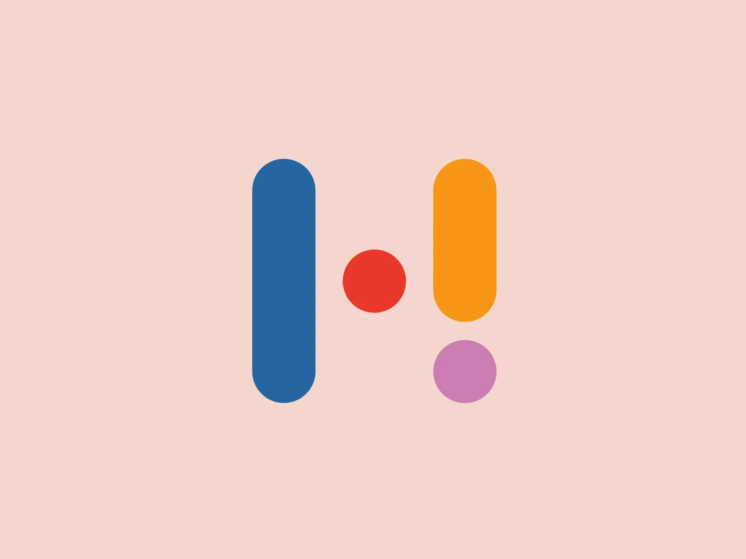
The Hay logo features a stylized arrangement of geometric shapes consisting of two vertically elongated rectangles and two circles. The rectangle on the left is colored in a deep shade of blue, while the one on the right has a vibrant yellow hue. The circle between the rectangles is smaller and colored bright red, providing a stark contrast to the rectangles. Below the red circle, slightly to the right, sits the second circle, which is a soft purple. The design has a minimalist and modern feel, relying on bold colors and simple forms to create an abstract yet harmonious composition.

About Hay

Hay is an Australian fintech company focused on developing cutting-edge digital infrastructure to offer a mobile-first financial solution tailored to the needs of modern Australians.

Similar logos

The Angi logo showcases a sleek "A" in a vibrant coral red color. Its modern and minimalistic design includes a flowing curve that creates an engaging loop at the base, imparting a friendly and professional look. The bold typeface with smooth edges balances thick and thin strokes, exuding both weight and elegance. The logo's style and color suggest a preference for a complementary background that doesn't overshadow it.
The Basis London logo presents a modern and minimalist stylized combination of geometric shapes that form the letter 'B'. The design consists of intersecting straight lines and curves in a dark blue or navy color, creating an illusion of three-dimensional layering. The negative space within the circular element adds to the overall balance and visual interest of the design.
The Meeka Metals logo features three stylized mountain peaks within a square frame. The central and left peaks are vibrant orange (#F7DED6), while the right peak and the negative space forming the valley below are a deep navy blue (#D9E5F9), creating a striking contrast. The clean, sharp angles convey modernity and stability, while the geometric approach gives the design a bold character, symbolizing strength and reliability. The overall aesthetic blends adventure and professionalism, showcasing a sense of boldness and stability. Hexcode: #E4E2F8
The Gearbest logo features a bold, black, stylized smile at its center, with the ends of the smile tapering to points. This simplistic and cheerful smile is prominently positioned against a vibrant yellow square background with rounded corners. The overall design aesthetic is modern and minimalistic, suggesting friendliness and positivity. The design's high contrast and simplicity would stand out well against a variety of backgrounds but would be particularly striking on a light, muted color to maintain its vibrancy without overwhelming its simplicity.
The Unilever logo appears to consist of intricate and stylized illustrations forming a shield-like shape. The design features a collection of floral and organic patterns, ranging from leaves and flowers to abstract swirls, all densely packed to create a cohesive emblem. It is monochromatic, using a deep blue color which gives it a classic and professional appearance. The contrast between the negative space and the blue areas creates an engaging and dynamic visual effect, suggesting detail and craftsmanship. The logo has a symmetrical layout that adds to its balanced and harmonious look.
The Cimaco logo features a modern and abstract design with three concentric circles decreasing in thickness from the outermost to the inner circle. Inside the circles, there is a unique element that seems to be a combination of a dot and a small crescent shape, aligned off-center towards the upper-left quadrant, creating a dynamic and forward-moving appearance. This element interrupts the continuity of the circles on one side, suggesting connectivity or targeting. The color is a solid, deep shade of blue, which conveys professionalism and trustworthiness. Overall, the logo has a clean, tech-savvy look with a minimalist aesthetic. Considering the color and design of the Cimaco logo, a light and neutral background would complement it well.
The logo in the image displays a symmetrical design resembling an abstract butterfly or a pair of wings. It consists of multiple leaf-like shapes radiating from the center, creating a harmonious pattern. Vibrant colors such as pink, orange, yellow, green, light blue, and teal are used, outlined with a thin black border that enhances their individuality. The overall design aesthetic is lively and organic, suggesting a sense of growth or transformation. The black background makes the colors pop, giving the logo a bold and energetic appearance.
The Kajabi logo consists of a bold, abstract geometric design forming a stylized letter 'K.' It is composed of two triangles in deep and light blue tones, creating a modern and energetic appearance with a dynamic aesthetic.
The logo for Lifetime is a simple yet bold design consisting of variations of circular shapes with a modern twist. The primary color of the logo is a bright red, creating a striking visual impact. The design features a large, solid red circle, from which a smaller circle and a swoosh-like shape have been subtracted, giving the appearance of a stylized letter "Q" or an abstract representation of a person. The negative space within the Lifetime logo is particularly effective in creating a dynamic and unique figure, promoting a sense of elegance and fluidity in the overall aesthetic.
The Akon Hidrolik logo exhibits a bold and minimalist design with a black square background. Within the square, a white geometric shape forms a stylized letter "a" with a red circle at the base, evoking the imagery of a needle's eye or a focal point. The overall aesthetic is modern and contemporary, utilizing primary colors and strong contrast to enhance its visual impact. Its simplicity renders it highly recognizable and versatile.