Brilliant Lighting

15
The Brilliant Lighting logo captivates us with its dynamic spiraling design and clean, modern aesthetic.

Brilliant Lighting Logo

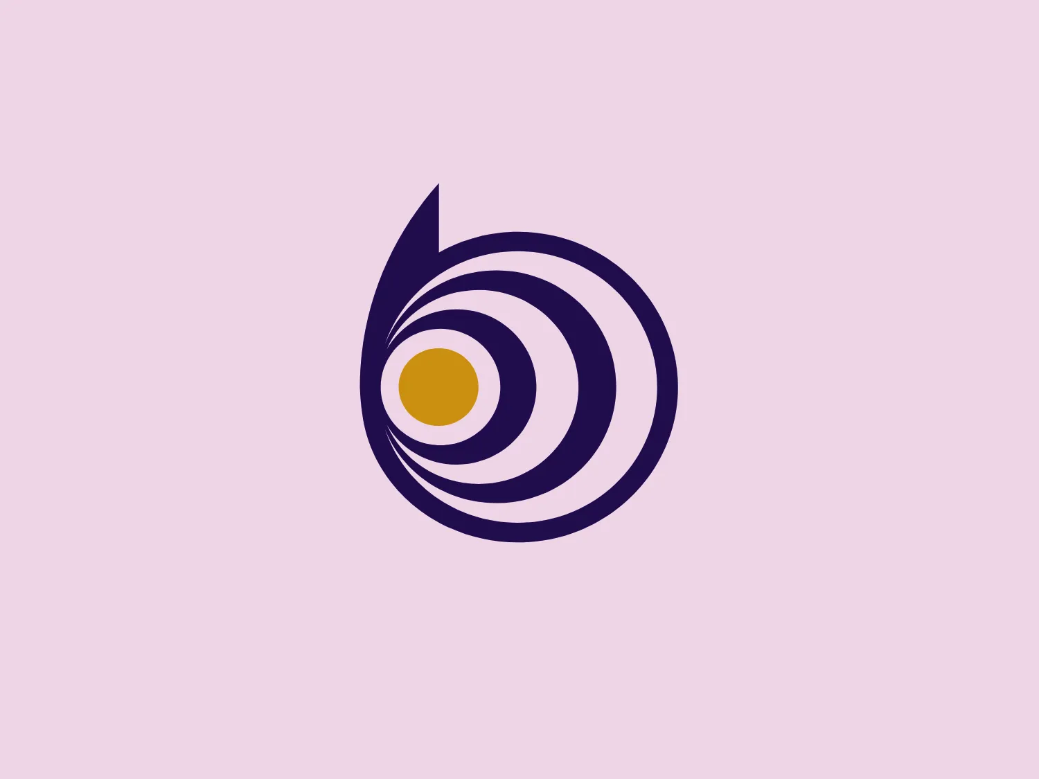
The Brilliant Lighting logo features an abstract, spiraling design that resembles an eye or a dynamic twirl. The centerpiece is a yellow dot, akin to a pupil or a sun, enclosed by a series of concentric circles that rotate around it. The circles alternate between white and a rich navy blue, creating a strong contrast and a sense of movement. The outermost swirl extends into a sharp, tail-like shape, which adds to the logo's dynamic and modern aesthetic. The design is bold and simple, using clean lines and a limited color palette to convey a sense of focus or vision.

About Brilliant Lighting

Brilliant Lighting is a company specializing in residential lighting, with a focus on lighting design, lighting control, and systems integration. The company's portfolio includes a wide range of projects, from ultra-modern houses to country houses and stately homes.

Similar logos

The Browze logo features a continuous line that forms a sleek fusion of the letters 'V' and 'B'. The design exudes elegance and modernity with its fluid and organic structure. Presented in monochrome, the black against white creates a timeless and classic feel. Its minimalist aesthetic draws attention to the beauty of the line's curve and the use of negative space. The design's seamless flow may suggest connectivity or unity, and its simplicity allows for versatility and scalability.
The Mobileye logo features a stylized letter 'n' with a distinct geometric design. It is comprised of bold, straight lines with sharp angles, creating a modern and minimalist aesthetic. The main component of the logo is a deep blue color, giving it a professional and trustworthy feel. The design is simple yet striking, with the use of negative space on the left side that could be interpreted as an abstract arrow or a partial square bracket, which adds an element of dynamism and forward-thinking to the overall design.
The Delivery Hero logo features a dynamic red comet shape with a stylized white star centered on its body. The comet tail metaphorically conveys speed, progress, or possibly a shooting star suggesting dreams and aspirations. The sharp edges of the star contrast with the smooth, curved form of the comet, giving the design a sense of forward motion. Its design is simple yet effective, easily scalable, and memorable. Considering the vibrancy of the red, a muted background that complements without competing would be ideal.
The image depicts the Akku Vertrieb logo with a bold, geometric design primarily using a bright blue color. The logo resembles an abstract depiction of an uppercase 'A' without the crossbar. It consists of three parallelogram shapes that form a stylized 'A' with white lines creating separation between them, adding a dynamic and layered effect. The design is sharp, modern, and conveys a sense of stability and professionalism. The simplicity and use of negative space give it a clean and versatile look, suitable for various applications.
The BETA Technologies logo features a bold, solid black letter "B" with a white lightning bolt cutting through its center, creating a modern and minimalist design. The stark contrast between the black and white elements emphasizes the strong visual impact of the logo. The lightning bolt infuses a sense of power and energy, suggesting dynamism and force. The classic, rounded attributes of the "B" combined with the edgy, contemporary feel of the lightning bolt create a striking visual identity for the business.
The Unilever logo appears to consist of intricate and stylized illustrations forming a shield-like shape. The design features a collection of floral and organic patterns, ranging from leaves and flowers to abstract swirls, all densely packed to create a cohesive emblem. It is monochromatic, using a deep blue color which gives it a classic and professional appearance. The contrast between the negative space and the blue areas creates an engaging and dynamic visual effect, suggesting detail and craftsmanship. The logo has a symmetrical layout that adds to its balanced and harmonious look.
The image showcases a bold and abstract Neufquatre Éditions logo, consisting of a stylized letter "N" with a dynamic, fluid shape. The design is minimalist and modern, using negative space effectively to create the impression of motion within the letter form. The logo is monochromatic, featuring a stark black against a clean white background. The simplicity of the design lends itself to versatility, while the curvature of the lines suggests creativity and innovation.
The Rossignol logo showcases a stylized white letter 'R' in the center of a bright red circular background. The 'R' includes a clean design with a striking slash through its stem, adding a modern flair. Smooth curves create a sleek look, and the red and white color scheme offers a bold and attention-grabbing contrast. The overall design aesthetic is minimalist and contemporary, making it versatile for various applications.
The WildBrain logo features three stylized, abstract figures in various shades of blue, resembling a trio of birds or perhaps aquatic creatures, positioned side by side with their body shapes converging at the base. The figures have a minimalist look, with a smooth, rounded top edge that tapers down to a point. Each figure also contains a simple, circular black eye, adding a touch of character and life to the design. The shapes are devoid of intricate details, favoring a clean and modern aesthetic. Considering the cool blue tones, a soft, contrasting background color would complement the logo without overpowering it.
The Basis London logo presents a modern and minimalist stylized combination of geometric shapes that form the letter 'B'. The design consists of intersecting straight lines and curves in a dark blue or navy color, creating an illusion of three-dimensional layering. The negative space within the circular element adds to the overall balance and visual interest of the design.