Creative Therapy

15
What catches our eye is the modern, minimalist design of Creative Therapy's logo, with a sleek tree icon against a vibrant blue shield layer.

Letter

Color

Blue
1412
Grey
229

Creative Therapy Logo

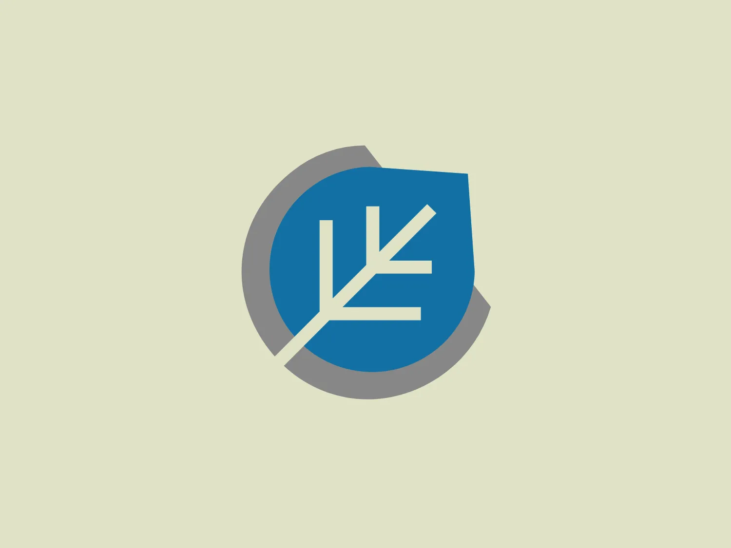
The logo for Creative Therapy features a modern and minimalist design consisting of a stylized tree or plant with branches, rendered in white, which is set against a solid blue shield shape. The shield is partially overlapped by a circular grey shape, suggesting dimensional layering. The blue is vibrant and contrasts well with the white and grey, giving the logo a professional and crisp appearance. The aesthetic is clean and straightforward with a tech or environmental vibe suggested by the choice of the tree-like iconography.

About Creative Therapy

Established in 2019, Creative Therapy Autism Centre is a locally owned practice that specializes in providing assessment and evidence-based intervention for children and youth with Autism Spectrum Disorder (ASD) and other developmental delays.

Similar logos

The Basis London logo presents a modern and minimalist stylized combination of geometric shapes that form the letter 'B'. The design consists of intersecting straight lines and curves in a dark blue or navy color, creating an illusion of three-dimensional layering. The negative space within the circular element adds to the overall balance and visual interest of the design.
The Framer logo consists of a bold, abstract geometric design that features two black shapes on a white background. These shapes resemble stylized arrowheads or triangular segments arranged back-to-back with a right angle between them, creating a dynamic and forward-moving impression. The overall design aesthetic is minimalist, modern, and hints at movement or transition. The logo's sharp angles and contrasting colors give it a striking appearance.
The Unilever logo appears to consist of intricate and stylized illustrations forming a shield-like shape. The design features a collection of floral and organic patterns, ranging from leaves and flowers to abstract swirls, all densely packed to create a cohesive emblem. It is monochromatic, using a deep blue color which gives it a classic and professional appearance. The contrast between the negative space and the blue areas creates an engaging and dynamic visual effect, suggesting detail and craftsmanship. The logo has a symmetrical layout that adds to its balanced and harmonious look.
The Meeka Metals logo features three stylized mountain peaks within a square frame. The central and left peaks are vibrant orange (#F7DED6), while the right peak and the negative space forming the valley below are a deep navy blue (#D9E5F9), creating a striking contrast. The clean, sharp angles convey modernity and stability, while the geometric approach gives the design a bold character, symbolizing strength and reliability. The overall aesthetic blends adventure and professionalism, showcasing a sense of boldness and stability. Hexcode: #E4E2F8
The Newsela logo features a square composed of a bold, bright blue outline with a slightly darker blue fill. Inside the square, there are two white rectangular shapes that resemble an open book or a window, given the symmetry and the central divide. The design is minimalist and modern, employing simple geometric shapes and a limited color palette to convey clarity and openness. With its clean lines and uncluttered appearance, the logo exudes professionalism and a sense of transparency.
The Browze logo features a continuous line that forms a sleek fusion of the letters 'V' and 'B'. The design exudes elegance and modernity with its fluid and organic structure. Presented in monochrome, the black against white creates a timeless and classic feel. Its minimalist aesthetic draws attention to the beauty of the line's curve and the use of negative space. The design's seamless flow may suggest connectivity or unity, and its simplicity allows for versatility and scalability.
The BETA Technologies logo features a bold, solid black letter "B" with a white lightning bolt cutting through its center, creating a modern and minimalist design. The stark contrast between the black and white elements emphasizes the strong visual impact of the logo. The lightning bolt infuses a sense of power and energy, suggesting dynamism and force. The classic, rounded attributes of the "B" combined with the edgy, contemporary feel of the lightning bolt create a striking visual identity for the business.
The Cimaco logo features a modern and abstract design with three concentric circles decreasing in thickness from the outermost to the inner circle. Inside the circles, there is a unique element that seems to be a combination of a dot and a small crescent shape, aligned off-center towards the upper-left quadrant, creating a dynamic and forward-moving appearance. This element interrupts the continuity of the circles on one side, suggesting connectivity or targeting. The color is a solid, deep shade of blue, which conveys professionalism and trustworthiness. Overall, the logo has a clean, tech-savvy look with a minimalist aesthetic. Considering the color and design of the Cimaco logo, a light and neutral background would complement it well.
The Kajabi logo consists of a bold, abstract geometric design forming a stylized letter 'K.' It is composed of two triangles in deep and light blue tones, creating a modern and energetic appearance with a dynamic aesthetic.
The logo in the image displays a symmetrical design resembling an abstract butterfly or a pair of wings. It consists of multiple leaf-like shapes radiating from the center, creating a harmonious pattern. Vibrant colors such as pink, orange, yellow, green, light blue, and teal are used, outlined with a thin black border that enhances their individuality. The overall design aesthetic is lively and organic, suggesting a sense of growth or transformation. The black background makes the colors pop, giving the logo a bold and energetic appearance.