Falcon IO


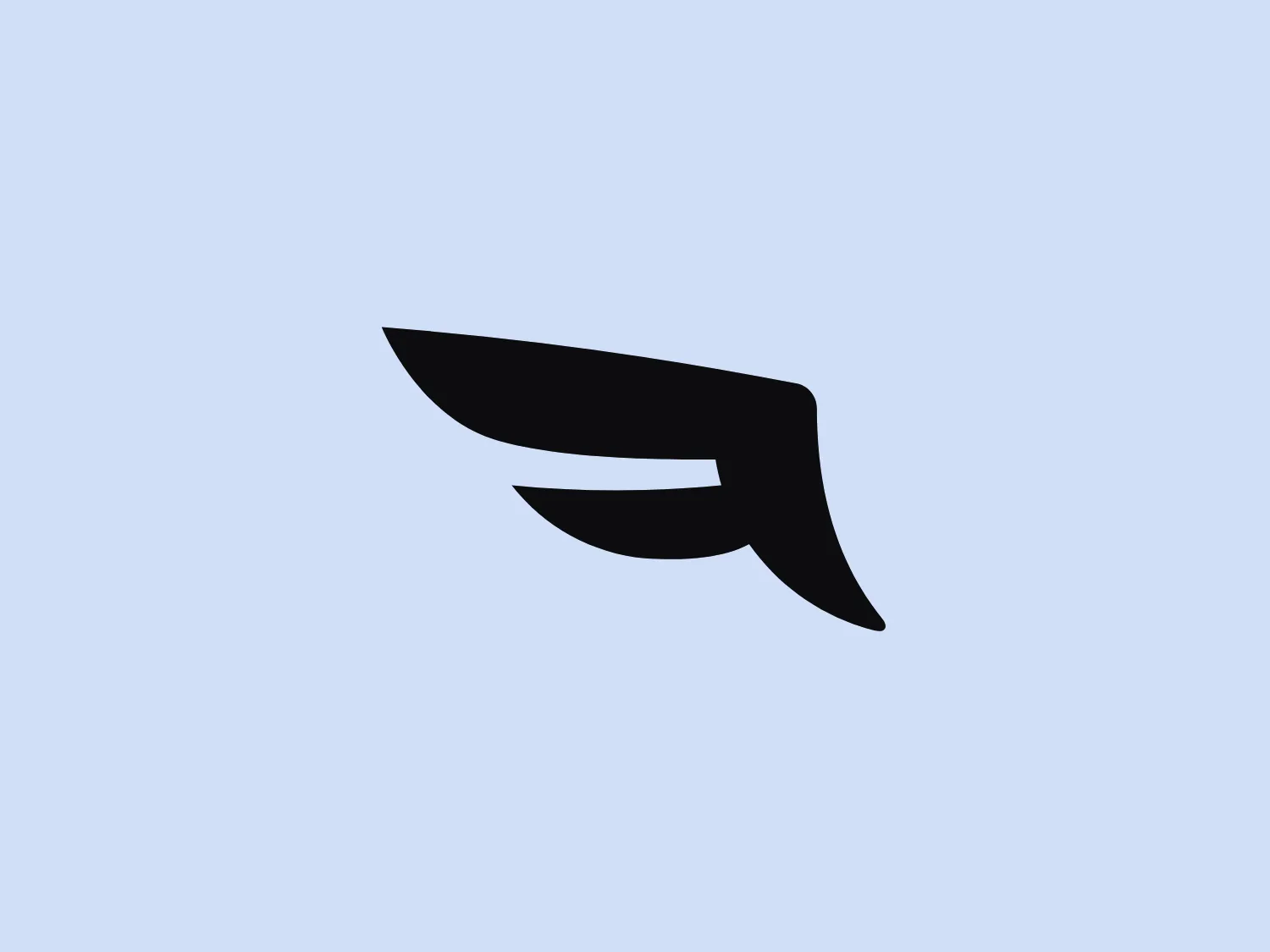
What we like is the sleek and modern stylized wing-like shape of the Falcon IO logo, conveying speed and agility.
Letter
Type
Color
Style
The Falcon IO logo showcases a stylized, abstract wing-like shape composed of bold, smooth lines that convey swift motion and dynamism. The design is minimalistic and modern, with two distinct elements resembling feathers or layers in motion. The overall shape suggests propulsion or speed, associated with flight, agility, or progress. The monochrome logo, using a deep black color, contrasts starkly with a white or light background, allowing for versatile use across various mediums.
Falcon IO provides a SaaS platform for social media management, offering services including listening, engagement, publishing, advertising, measurement, and customer data management. It has recently been integrated into Brandwatch.
Similar logos
NEW

The Browze logo features a continuous line that forms a sleek fusion of the letters 'V' and 'B'. The design exudes elegance and modernity with its fluid and organic structure. Presented in monochrome, the black against white creates a timeless and classic feel. Its minimalist aesthetic draws attention to the beauty of the line's curve and the use of negative space. The design's seamless flow may suggest connectivity or unity, and its simplicity allows for versatility and scalability.
NEW

The Rossignol logo showcases a stylized white letter 'R' in the center of a bright red circular background. The 'R' includes a clean design with a striking slash through its stem, adding a modern flair. Smooth curves create a sleek look, and the red and white color scheme offers a bold and attention-grabbing contrast. The overall design aesthetic is minimalist and contemporary, making it versatile for various applications.
NEW

The Delivery Hero logo features a dynamic red comet shape with a stylized white star centered on its body. The comet tail metaphorically conveys speed, progress, or possibly a shooting star suggesting dreams and aspirations. The sharp edges of the star contrast with the smooth, curved form of the comet, giving the design a sense of forward motion. Its design is simple yet effective, easily scalable, and memorable. Considering the vibrancy of the red, a muted background that complements without competing would be ideal.
NEW

The image showcases a bold and abstract Neufquatre Éditions logo, consisting of a stylized letter "N" with a dynamic, fluid shape. The design is minimalist and modern, using negative space effectively to create the impression of motion within the letter form. The logo is monochromatic, featuring a stark black against a clean white background. The simplicity of the design lends itself to versatility, while the curvature of the lines suggests creativity and innovation.
NEW

The BETA Technologies logo features a bold, solid black letter "B" with a white lightning bolt cutting through its center, creating a modern and minimalist design. The stark contrast between the black and white elements emphasizes the strong visual impact of the logo. The lightning bolt infuses a sense of power and energy, suggesting dynamism and force. The classic, rounded attributes of the "B" combined with the edgy, contemporary feel of the lightning bolt create a striking visual identity for the business.
NEW

The BOSS logo features a blue square with rounded corners, enclosing a modern and minimalist white letter 'b'. The 'b' has a sleek, open design created from a single line with a smooth curve, and the vibrant blue contrasts sharply against the white, offering a bold and clean appearance. The simplicity of the logo makes it versatile for various applications and suggests a brand identity associated with innovation or technology.
NEW

The Meralco logo features a stylized, angular lightning bolt in white, cutting dynamically across a vibrant, solid orange circle. The bolt itself has sharp edges and points, conveying a sense of energy and power. The simplicity of the design gives it a modern and impactful aesthetic, as the high-contrast color scheme makes the logo stand out boldly. The circular shape envelops the bolt, suggesting completeness and a global or universal aspect to the brand identity.
NEW

The Osiris Shoes logo is a simple and modern design featuring geometric shapes. It includes a large black semicircle balanced above a smaller white circle, with an even smaller black circle at its center. The minimalist aesthetics and use of negative space create a sense of harmony and balance. The monochromatic color scheme gives the logo a versatile and timeless feel. A soft and neutral background would complement the logo without overwhelming its design.
NEW

The Shazam logo is a stylized representation of a dynamic and fluid shape reminiscent of a swirl or a spiral, contained within a circle. It consists of two interconnected, thick, curved lines creating a sense of motion and connectivity. The logo employs a duo-tone color scheme, with the main symbol in white standing out against a vibrant, deep blue background. The overall design aesthetic is modern, clean, and suggests either movement, digital technology, or a creative, abstract concept. Additionally, there is a gradient effect within the blue circle, giving it a more three-dimensional look and adding depth to the design.
NEW

The Mensa International logo features a bold, white capital letter 'M' centered within a circular badge. Above the letter 'M', a stylized white globe icon emphasizes international presence. The letter rests against a vibrant orange background, creating a striking contrast that accentuates the white elements. The modern and concise design utilizes simple geometric shapes and clear iconography, suggesting a professional and global brand identity.