China Merchants Bank

15
We like the modern geometric interpretation of the "M" in the China Merchants Bank logo, exuding precision and sophistication.

Letter

Type

Color

Style

China Merchants Bank Logo

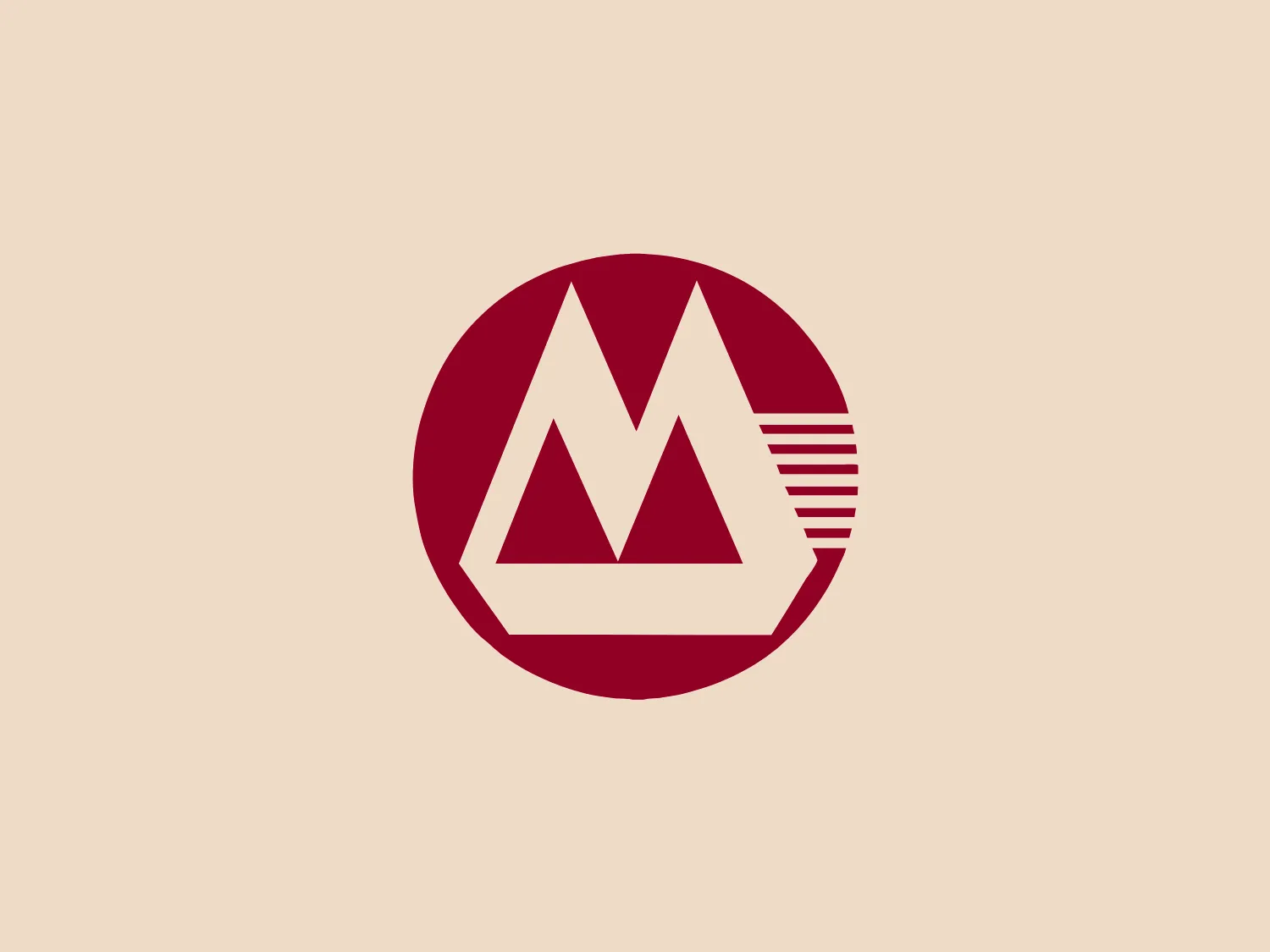
The China Merchants Bank logo features a stylized white uppercase "M" within a deep maroon circle. The "M" has unique geometric attributes; the left and right legs of the letter are solid white triangles, while the center leg is represented by five evenly spaced white horizontal lines. This gives the effect of a letter broken into parts, suggesting motion or digital data streaming. The clean lines and modern interpretation of a traditional letter shape lend the logo a sense of precision and technological sophistication.

About China Merchants Bank

China Merchants Bank (CMB) is the first joint-stock commercial bank in China to be wholly owned by corporate legal entities. The bank has been at the forefront of the industry's reform efforts, originating from entities outside of the government.

No items found.

Similar logos

The Browze logo features a continuous line that forms a sleek fusion of the letters 'V' and 'B'. The design exudes elegance and modernity with its fluid and organic structure. Presented in monochrome, the black against white creates a timeless and classic feel. Its minimalist aesthetic draws attention to the beauty of the line's curve and the use of negative space. The design's seamless flow may suggest connectivity or unity, and its simplicity allows for versatility and scalability.
The BETA Technologies logo features a bold, solid black letter "B" with a white lightning bolt cutting through its center, creating a modern and minimalist design. The stark contrast between the black and white elements emphasizes the strong visual impact of the logo. The lightning bolt infuses a sense of power and energy, suggesting dynamism and force. The classic, rounded attributes of the "B" combined with the edgy, contemporary feel of the lightning bolt create a striking visual identity for the business.
The Delivery Hero logo features a dynamic red comet shape with a stylized white star centered on its body. The comet tail metaphorically conveys speed, progress, or possibly a shooting star suggesting dreams and aspirations. The sharp edges of the star contrast with the smooth, curved form of the comet, giving the design a sense of forward motion. Its design is simple yet effective, easily scalable, and memorable. Considering the vibrancy of the red, a muted background that complements without competing would be ideal.
The image showcases a bold and abstract Neufquatre Éditions logo, consisting of a stylized letter "N" with a dynamic, fluid shape. The design is minimalist and modern, using negative space effectively to create the impression of motion within the letter form. The logo is monochromatic, featuring a stark black against a clean white background. The simplicity of the design lends itself to versatility, while the curvature of the lines suggests creativity and innovation.
The Rossignol logo showcases a stylized white letter 'R' in the center of a bright red circular background. The 'R' includes a clean design with a striking slash through its stem, adding a modern flair. Smooth curves create a sleek look, and the red and white color scheme offers a bold and attention-grabbing contrast. The overall design aesthetic is minimalist and contemporary, making it versatile for various applications.
The Osiris Shoes logo is a simple and modern design featuring geometric shapes. It includes a large black semicircle balanced above a smaller white circle, with an even smaller black circle at its center. The minimalist aesthetics and use of negative space create a sense of harmony and balance. The monochromatic color scheme gives the logo a versatile and timeless feel. A soft and neutral background would complement the logo without overwhelming its design.
The Meralco logo features a stylized, angular lightning bolt in white, cutting dynamically across a vibrant, solid orange circle. The bolt itself has sharp edges and points, conveying a sense of energy and power. The simplicity of the design gives it a modern and impactful aesthetic, as the high-contrast color scheme makes the logo stand out boldly. The circular shape envelops the bolt, suggesting completeness and a global or universal aspect to the brand identity.
The BOSS logo features a blue square with rounded corners, enclosing a modern and minimalist white letter 'b'. The 'b' has a sleek, open design created from a single line with a smooth curve, and the vibrant blue contrasts sharply against the white, offering a bold and clean appearance. The simplicity of the logo makes it versatile for various applications and suggests a brand identity associated with innovation or technology.
The business' name is creatively designed within the logo, with a bold black "B" featuring a stylized cut in the form of a white diamond shape situated at the center-right of the letter. The font has a geometric and sans-serif style, giving the logo a minimalist and modern aesthetic. The high contrast between the black letter and the white space within it adds to its contemporary feel.
The Heco Chain logo features a stylized representation of two interacting shapes, resembling puzzle pieces. The design includes two bold, curving forms with rounded edges, mirroring each other for a sleek and modern appearance. The rich, deep green color signifies professionalism and growth, while the white lines create a crisp contrast and a three-dimensional illusion. This logo has a clean, contemporary feel suitable for technology, environmental fields, or innovative services.